Key points
- The findings from this report paint a complex picture of quality measurement in three clinical areas in the NHS. It highlights how multiple sources and numerous national bodies preside over data collection and explores whether there is a case for rationalisation and simplification in order to ensure that data are being used most effectively to bring benefits to patients and clinical teams.
- During 2017, we mapped the quality indicators for three clinical areas: breast cancer care, children and young people's mental health (CYPMH) care and renal care. We identified a large number of national quality indicators, sitting across multiple sources (such as audits or patient surveys), for each of the three clinical areas. For breast cancer care there were 68 indicators and 23 sources. For CYPMH care there were 56 indicators and 15 sources. For renal care there were 47 indicators and 16 sources.
- We found multiple organisations using or collecting indicator datasets: 11 for breast cancer care, six for CYPMH care and 10 for renal care. It was difficult to establish which national bodies were looking at which data, and for what purpose. A lot of the data were very hard to locate online.
- Indicators are published at a number of different levels, ranging from all-England, to trust and ward level. We found considerably fewer indicators for which data was published at trust and ward or team levels than the total number of national quality indicators. For breast cancer care, 32 out of 68 indicators were published at trust level, and 10 were published at ward or team level. For CYPMH care, 13 out of 56 indicators were published at trust level, and one was published at ward or team level. For renal care, 24 out of 47 indicators were published at trust level, and 10 were published at ward or team level.
- Between July 2017 and March 2018, we conducted interviews with 52 clinicians and managers working in five separate teams or units (based within hospital trusts), who were delivering services across the three areas. Awareness of national quality indicators was high among clinicians and managers working in breast cancer care and renal care, and most indicators were considered either relevant, meaningful or both. However, awareness was lower among those working in CYPMH care, and there was less agreement on how relevant or meaningful the indicators were.
- Waiting time targets were the most familiar quality indicators across all three clinical areas. These targets dominated conversations within clinical teams working in breast cancer care, and increasingly within CYPMH care teams. Interviewees across all five case study sites expressed a desire for more emphasis on, and greater measurement of, patients’ experience of health care services.
- Our interviews suggest that little insight or use is being derived locally from national quality indicators, with the exception of the annual Multisite Dialysis Access Audit for renal care. Apart from this, there was a big gap between the national data that was actually available and what clinical teams used. Many clinical teams reported generating local data for improving their services, and were interested in seeing more national data on the quality of the service they are giving to patients.
- Given the high volume of national indicators across multiple sources, and multiple national bodies sponsoring and using the data, there is a case for reviewing national quality measurement with a view to streamlining and simplifying it. It is currently not clear whether there is a mechanism or organisation that maintains an overview of all the indicators in use across the system, or across the whole patient pathway for a clinical area.
- If the perceptions of the clinical teams we spoke to for this report are in any way indicative of those of other teams and clinical areas, it suggests there is untapped potential for using national quality measurement for local quality improvement. Our findings suggest that the appetite for improvement is there, but that policymakers’ aspiration for local clinical teams to use national indicators to their full effect has not come to fruition.
- A more coherent national framework might need to articulate and differentiate more clearly between the different audiences for, and purposes of, quality measurement, with a greater focus on clinical teams.
Introduction
The NHS is recognised as having led the way internationally for its policies to improve the quality of care over recent decades. These have resulted in an extensive and complex infrastructure of organisations and initiatives being involved in the measurement of care quality in England, at both a national and a local level.
Quality measurement has many different audiences, including parliament, government, NHS managers and staff, regulators, patients and the public. This is because it has many different functions, such as performance management, public accountability, providing patients with information to support choice, informing research, and as a tool for quality improvement.1 Which quality indicator is appropriate depends on what it will be used for: measures of accountability, for example, need to be more robust and comparable than measures that are used to improve quality at a local level, by a clinical team or within a hospital. Gauging the quality of care is complex: all datasets have their limitations, and most indicators are pointers rather than absolute markers of performance.
The volume of data requested by national bodies to monitor the quality of NHS care in England has grown rapidly in recent decades. At the same time, the number of organisations that define indicators of care quality has increased, and many of them also collect, process and publish data relating to these indicators nationally.
Measurement and data are essential to local quality improvement, and data can often be generated by local teams to suit their own purposes. Local quality improvement activities are therefore not solely dependent on national quality data. Nevertheless, policymakers have been attracted to the idea of a self-improving health service underpinned by nationally published quality indicators. This was demonstrated when the former secretary of state for health, Jeremy Hunt, championed the idea of ‘intelligent transparency’ driving change in 2015:
‘Self-directed improvement is the most powerful force unleashed by intelligent transparency: if you help people understand how they are doing against their peers and where they need to improve, in most cases that is exactly what they do. A combination of natural competitiveness and desire to do the best for patients mean rapid change – without a target in sight.’
There have been several attempts to systematically draw together some of these national measures of quality across the NHS, as a mechanism for accountability and to drive improvement. These include the NHS Performance Assessment Framework in 1999, and the national outcomes frameworks from 2012. Both of these initiatives combined quality indicators from a range of sources. However, they were largely designed to assist with performance management at national, regional and commissioner levels, rather than to be used by front-line teams.
In 2009, the searchable database Indicators for quality improvement was launched by NHS Digital. This was explicitly aimed at making national measures available to front-line teams for quality improvement, but has now been archived. There have since been several national reviews into how performance measurement of local health systems could be improved, including the Department of Health-commissioned Measuring the performance of local health systems.
In early 2019, the NHS Long Term Plan set out new objectives to improve the quality of care across a wide range of clinical areas, with a pledge to support clinicians to lead these improvements. At the same time, NHS England has begun a review of some high-profile national measures of quality (in particular waiting times), and has started to pilot new measures.
This research places these developments in context by offering a snapshot of the complexity of national quality measurement and its perceived use to clinical teams as a tool for improvement. The aims of this study were to explore:
- how many quality measures exist
- who collects the relevant data, and how frequently these data are published
- whether front-line staff are aware of these national indicators
- if front-line staff use the indicators to improve care for their patients.
This report explains our methodology for both the desk research and interviews, before detailing what we found. First, the indicators across the three clinical areas are mapped in relation to timeliness, publication level and comparability. We then use the interview findings to incorporate perspectives from what the clinical teams shared in relation to how familiar, meaningful and useful the indicators are at a local level. We also examine the types of additional local indicators that exist, and the indicators the teams have identified as lacking. The discussion explores the findings of this research in relation to quality indicator development across the NHS in England.
What we did
This analysis explores how quality is measured at a national level in England, in three specific clinical areas: breast cancer care, children and young people’s mental health (CYPMH) care and renal care.
We selected these clinical areas because of their differing levels of national scrutiny. Breast cancer care was chosen because cancer is a national priority. Additionally, breast cancer has for some time been a key priority within cancer services, with roots back to the NHS Cancer Plan in 2000. Renal care was chosen because of its relatively low profile at a national level, but also because it is associated with the UK Renal Registry – a longstanding registry which collects quality data. CYPMH care was chosen because, in contrast to cancer and renal care, national quality measurement in this area is a relatively new development, and we wanted to speak to clinical teams working outside of acute hospital settings. Within CYPMH care we focused on indicators relating to young people aged 14 to 18 years, not including those with learning difficulties or looked after children.
The research was in two interrelated parts: desk research in the form of quality indicator mapping and analysis, and fieldwork in the form of semi-structured interviews.
Mapping the indicators
We compiled a list of the national quality indicators specified for breast cancer care, CYPMH care and renal care. These were taken from a wide range of sources, such as regulatory frameworks, official datasets, registries, audits, dashboards and patient surveys.
The lists of indicators were designed to give a comprehensive snapshot of quality metrics that were directly relevant to the services being delivered by the clinical teams we spoke to. As a result, they are not exhaustive. For example, we did not include indicators on screening in the breast cancer care list, indicators on mental health spending or transformation milestones in the CYPMH care list, or indicators on kidney transplants in the renal care list. We only included indicators that were part of a formal, national measurement framework or similar.
To explore these indicators in more detail, we analysed them in the context of the following considerations:
- source – such as a national framework or patient survey
- organisations requesting, using and/or monitoring the data
- indicator type – for example, an outcome measure
- publication level of indicator data – for example, trust level
- timeliness and granularity of the data published.
The lists and mapping exercise were up to date as at November 2017, to the best of our knowledge. Although the specific indicators may have changed over time, what is clear from the mapping exercise is that this is a complex landscape. For certain indicators, where we were unable to locate publications online, we contacted the collecting or sponsoring organisation to check whether and where the data was made available. For example, through speaking to members of Public Health England’s National Cancer Registration and Analysis Service (NCRAS) team we became aware of the CancerStats website (now CancerStats2), which is accessible to any registered NHS user.
Case study interviews
We explored front-line clinicians’ and managers’ awareness and use of national quality indicators through semi-structured interviews across the following five case study sites:
- Imperial College Healthcare NHS Trust (breast cancer)
- Sheffield Teaching Hospitals NHS Foundation Trust (breast cancer)
- Sheffield Teaching Hospitals NHS Foundation Trust (renal care)
- Portsmouth Child and Adolescent Mental Health Services (CYPMH)
- Southampton Child and Adolescent Mental Health Services, and Southampton Children’s Hospital (CYPMH).
We selected the five case study sites through convenience sampling: contact was initiated through existing Health Foundation contacts (alumni, award holders and others) across each of the three areas, and the final list was dictated by clinician and manager availability within the services. It was not designed to be representative of the NHS in England as a whole, but instead to generate themes for further research and debate.
It is likely that some of the teams featured in the case studies have above-average awareness of national benchmarking data and use it more than most. For example, the renal care team at Sheffield Teaching Hospitals NHS Foundation Trust has a strong improvement track record; and we know that organisations with higher maturity in quality improvement governance are outward-looking and use national benchmarks for quality, safety and experience.
The fieldwork involved interviews with 52 clinicians and managers between July 2017 and March 2018. These included clinical directors, consultants, senior doctors, nurses, managers, IT specialists and administrative staff, with recruitment aiming to generate insights from across the range of professions working at each case study site. We explored six broad themes in the interviews:
- How familiar are clinical teams with the national quality indicators?
- How meaningful and/or relevant are the indicators?
- Do clinical teams receive feedback from national bodies or access national data on the indicators?
- Do they use national data on the indicators to improve services locally?
- What additional local quality indicator data do they collect and/or use?
- What quality indicators are missing?
Notes were taken during the interviews and case study reports were written for each site. Our analysis of these case studies sought to draw out the differences and commonalities between approaches across the five sites and three specialities.
We also spoke to a number of people working in quality measurement and quality improvement in arm’s-length bodies (ALBs), both to inform the research and to share emerging findings. This included the National Quality Board’s Measuring Quality Working Group, hosted by NHS England, and the Indicator Governance Board, hosted by NHS Digital.
What we found
Volume of indicators and organisations involved
Table 1 demonstrates the complexity of how quality is measured at a national level across the three clinical areas.
Table 1: Number of indicators for each clinical area, detailed alongside organisational involvement and the number of sources
|
Clinical area |
No. of indicators |
No. of organisations involved |
Highest no. of organisations using or collecting data on any one indicator |
No. of sources |
|
Breast cancer care |
68 |
11 |
8 |
23 |
|
CYPMH care |
56 |
6 |
5 |
15 |
|
Renal care |
47 |
10 |
5 |
16 |
In all three clinical areas, there were a high number of national indicators that were relevant to the services the teams delivered. Many of the indicators included in the clinical area lists were not specific to the clinical area itself. For example, for breast cancer care many of the indicators related to cancer or inpatient care more generally. The volume of indicators surprised both the clinicians and managers we spoke to during the fieldwork, and the people working in the ALBs.
Trusts were required to report data against 47 of the 68 breast cancer care indicators, 43 of the 56 CYPMH care indicators and 34 of the 47 renal care indicators. The remainder of the indicators were either not mandated for reporting (such as National Institute for Health and Care Excellence (NICE) quality standards and statements, which take the form of guidance rather than requirements) or they involved data that was collected outside of trusts (such as patient surveys run by the Care Quality Commission (CQC)).
The indicators were included in multiple sources, such as regulatory frameworks, official datasets, registries, audits, dashboards and patient surveys. During the course of the mapping exercise, a small number of the indicators moved, changed or were withdrawn from their original source.
To add further complexity, the indicators were sponsored, owned and used by multiple organisations, making it difficult to establish who was looking at which data and for what purpose. Table 1 shows that some indicators were under particular scrutiny: in breast cancer care the highest number of organisations collecting data on or using any one indicator was eight, whereas for both CYPMH care and renal care the highest number was five.
Type of indicator
Different types of indicators can be used to measure quality in health care. We used the following five types for this analysis:
- Outcome: a measure of the health status of a patient or the impact of the health care service (for example, rates of readmission, mortality or survival).
- Process: a measure of adherence to standards or procedures of a non-clinical nature (for example, waiting times).
- Clinical process: a measure of adherence to standards or procedures of a clinical nature (for example, regular blood pressure monitoring for hypertension, statin prescribing or recording of hormone status).
- Patient reported experience measures (PREMs): a measure of people’s experience of health care services, as reported by patients (for example, the NHS Friends and Family Test).
- Patient reported outcome measures (PROMs): a measure of the health status of patients as reported by patients (for example, pain levels or quality of life before and after surgery).
Figure 1 shows that the majority of indicators found for breast cancer and renal care were outcome measures, whereas for CYPMH care the majority were process measures. For all three clinical areas there were similar proportions of clinical process measures, relatively few PREMs and only CYPMH care had any PROMs (the NHS Improvement’s Mental Health Safety Thermometer).
Figure 1: Proportion of each type of quality indicator for each of the three clinical areas
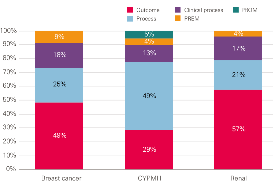
Source: Health Foundation analysis
Box 1: A deeper dive into the breast cancer care indicators
The table below illustrates further complexity behind the breast cancer care indicators. This is not unique to breast cancer care and similar complexity was also evident for CYPMH and renal care. It shows the split across the indicator types by the organisation collecting data on or using the indicators.
NHS England was involved in the data collection for, or use of, the majority of process measures and all PREMs, while Public Health England was involved in the majority of clinical process measures. The highest involvement in outcome measures was split between Public Health England, NHS Improvement and the Department of Health.
Table 2: The number of each indicator type, detailed alongside the organisation collecting data on or using the breast cancer care indicator
|
Organisation collecting data on or using the indicator |
Indicator type |
Total |
|||
|
Process |
Clinical process |
Outcome |
PREM |
||
|
Public Health England |
5 |
7 |
13 |
4 |
29 |
|
NHS England |
11 |
7 |
6 |
25 |
|
|
NHS Improvement |
4 |
11 |
2 |
18 |
|
|
Department of Health |
3 |
0 |
10 |
2 |
15 |
|
Health Quality Improvement Partnership |
4 |
2 |
7 |
0 |
13 |
|
Association of Breast Surgery |
4 |
2 |
7 |
0 |
13 |
|
Royal College of Surgeons |
4 |
2 |
7 |
0 |
13 |
|
Care Quality Commission (CQC) |
5 |
1 |
5 |
1 |
12 |
|
NHS Digital |
4 |
0 |
6 |
1 |
11 |
|
Clinical commissioning groups (CCGs) |
2 |
0 |
5 |
2 |
9 |
|
Sustainability and transformation partnerships |
2 |
0 |
1 |
4 |
7 |
|
Quality Health |
1 |
0 |
0 |
4 |
5 |
|
Not mandated or routinely reported |
1 |
2 |
0 |
0 |
3 |
|
Total† |
17 |
12 |
33 |
6 |
68 |
† Note: When summing up the the numbers for each organisation and indicator type they exceed the total number shown, as in many cases more than one organisation collected data on or used the indicator.
Publication level
We investigated whether data was published for each indicator. We defined ‘published’ to mean both data that is in the public domain and data that is available only to NHS users. We further broke this down to look at what level of the system the data is available at: national, clinical commissioning group (CCG), trust and ward or team.
As shown in Figure 2, while the number of national indicators we found for all three clinical areas was high, not all were published, and there were considerably fewer indicators for which data was published at trust and ward or team levels.
Figure 2: Publication level of the indicators across the three clinical areas
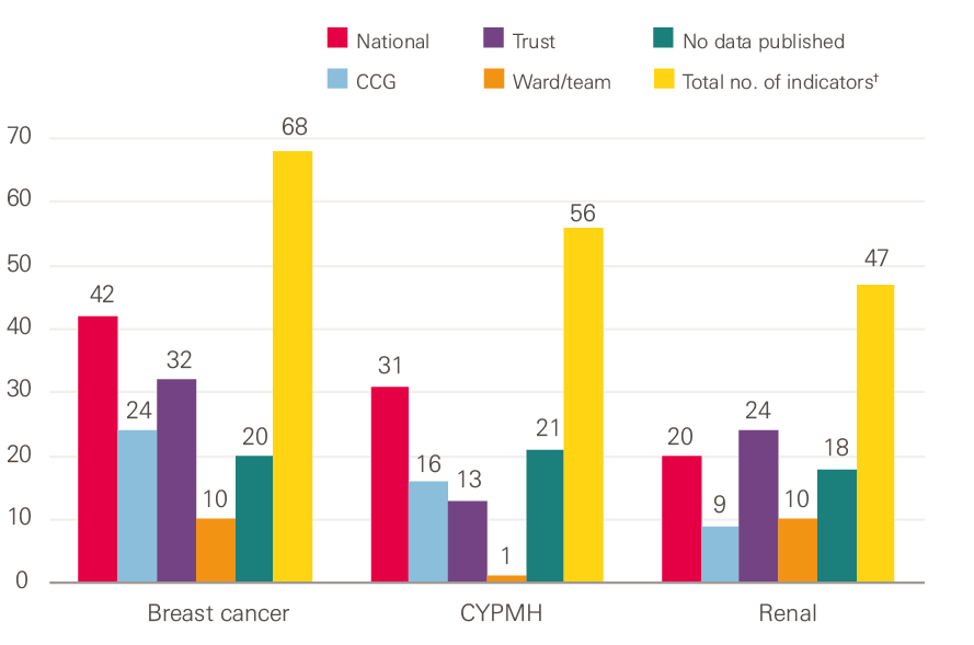
†Note: When summing the numbers for each level of publication they exceed the total number of indicators because many of the indicators are published at more than one level of the system.
Source: Health Foundation analysis
The ‘No data published’ category in Figure 2 includes the NICE quality standards and statements, which are not mandated for collection. In addition to these, we could not find any data published at any level for 17 of the breast cancer care indicators, eight of the CYPMH care indicators, and eight of the renal care indicators.
Timeliness and comparability of the published data
We looked at the frequency of publication, the data time lag and the availability of benchmarked and time series data.
Trust level
Most trust-level indicator data was published at a frequency of quarterly or higher: 85% for CYPMH care and 75% for both breast cancer care and renal care. The majority of trust-level indicator data was published with a time lag of three months or less: 75% for breast cancer care, 69% for CYPMH care and 67% for renal care. Time series data was available for the majority (78%) of trust-level breast cancer care indicators, but for significantly fewer of the CYPMH care and renal care indicators, at 46% and 42% respectively. All of the CYPMH care and all but one of the breast cancer care indicators at a trust level provided benchmarked data, however this was much lower (75%) for the renal care indicators.
Ward or team level
At a ward or team level, the proportion of indicator data for breast cancer care and renal care that was published at a frequency of quarterly or higher fell to 50% and 60% respectively; the remainder was published annually. Half of both the breast cancer care and renal care indicators were published with a time lag of three months or less, while the other half had a time lag of more than 12 months. The majority of the breast cancer care indicators had time series (80%) and benchmarked (90%) data available. No time series data could be located for the renal care indicators and benchmarked data could only be found for half of them. The only CYPMH indicator published at a ward or team level was published monthly with a time lag of one to three months. There was benchmarked data available for this indicator, but no time series.
Even where the indicator data were released in a timely and comparable form, the interviews suggested that the potential usefulness for trusts, wards or teams was limited by the data being hard to locate online, with multiple spreadsheets to choose from and large Excel workbooks to download and navigate.
* We acknowledge that there are valid and unavoidable reasons why data cannot be made available for all the indicators at trust, or ward or team, level.
Perspectives from clinical teams
Familiarity with quality indicators
In the fieldwork, we explored the familiarity of clinicians and managers with the national quality indicators. We did this first unprompted, to see what spontaneous knowledge people had of any indicators, and then with the lists as a guide. There was, unsurprisingly, considerable variation between teams (and between individuals within teams) in relation to which indicators people recalled spontaneously, and their levels of awareness when presented with the lists.
Spontaneous recall
For team members in the renal care unit, the UK Renal Registry was clearly well known as a source of quality indicators. Some interviewees were aware of the registry itself as a potential source of indicators, while others pointed to the annual Multisite Dialysis Access Audit (run by the registry). About half of the interviewees could name specific indicators derived from the registry which are used by NHS England for the renal indicator dashboards, including rates of infection and access to transplant lists for patients. National waiting times indicators (the 18-week referral to consultant-led treatment and the six-week diagnostic test target, which are applicable to most specialties) were mentioned much less frequently.
By contrast, for breast cancer care and CYPMH care, waiting time targets were most likely to be mentioned spontaneously. Some interviewees knew about specific indicators based on NICE guidelines and quality statements, or those that were linked to professional associations (for example, the Association of Breast Surgery). These were generally mentioned by the members of staff most directly involved with specialised aspects of care, such as surgery. Members of the CYPMH care teams were broadly aware of waiting times, but also outcome measures (which are not routinely collected at a national level) and the Friends and Family Test.
Awareness
Once lists were presented as a reference point, we found high levels of familiarity with and awareness of many of the indicators among the breast cancer care and renal care teams. There was, however, notably less awareness among the CYPMH care teams. National quality measurement in CYPMH care is relatively new: the first Mental Health Five Year Forward View Dashboard report was published in January 2017, and the children and young people’s eating disorders waiting time standard came into effect in April 2017.
For all three clinical areas, familiarity was stronger with indicators that were trust key performance indicators (KPIs), such as waiting times and serious safety incidents. Waiting time targets were particularly dominant within breast cancer care, and this appeared to be increasingly becoming the case within CYPMH care.
Familiarity was less strong for indicators not immediately relating to a clinician’s own practice. For example, there was less familiarity among breast surgeons with chemotherapy or radiotherapy measures; mental health practitioners or clinicians working in the community had less knowledge of indicators relating to hospital care; and haemodialysis nurses were less aware of peritoneal dialysis measures.
Clinicians and managers associated some of the indicators with the national organisations using them; for example, those used in CQC inspections or NICE quality standards and those set by professional associations or used as part of clinical audits. For the remainder, there was a general lack of understanding around which organisations set the indicators and collected the data, or what they were used for.
How meaningful are the quality indicators to clinical teams?
Waiting time targets dominated conversations within breast cancer care teams. The targets were generally accepted as being meaningful and a relevant measure of quality, given the impact of prompt treatment on both patient outcomes and experience. In the words of one clinician, the measures ‘keep the focus on not allowing patients to drift’.
Waiting time indicators were also seen as having a performance management dimension, bringing scrutiny from managers within the trust (although this was not always welcome). According to an interviewee in one of the teams, the volume of patients in the breast cancer service meant that ‘we carry the rest of the trust’, in terms of overall trust performance.
Despite being a relatively new development, waiting time targets also seemed to be growing in importance within the CYPMH care teams we spoke with. Prompt treatment was seen as important, especially for higher risk patients – as one interviewee put it, ‘without waiting times, people will wait forever.’
There were some frustrations. People spoke about waiting times being used by commissioners as the main way of measuring performance. They also said that action to improve waiting times often resulted in spare capacity being moved to one point in the pathway (such as early assessment) at the expense of other parts (such as capacity to provide treatment for those who then need it). Waiting time targets were seen as less relevant in the context of renal care, which is consistent with the smaller proportion of waiting time indicators identified on the list of national indicators.
Indicators that could be linked with clinical outcomes, patient experience, trust KPIs and CQC inspections were widely accepted as meaningful. There was some variation between the three clinical areas. For example, the high rate of day cases for breast cancer surgery reduced the relevance of inpatient safety measures, and infection rates were a high priority for renal care given the risks associated with dialysis.
Indicators relating to protocols or guidelines were not identified by clinicians and managers as being meaningful in themselves, but they did appear to be well established within normal clinical practice. For instance, NICE guidelines were seen as important within CYPMH care because ‘they set a benchmark’. However, there was occasional criticism; for example, the NICE quality standard for children and young people with suspected depression is to have their diagnosis confirmed and recorded in their medical records; but mental health practitioners were wary of labelling children and young people or pushing them down a particular pathway or route prematurely.
The Friends and Family Test was frequently cited. While many interviewees acknowledged that it is a fairly limited tool, it was still seen as a valuable resource, without which there would be a considerable gap in measuring patient experience. Positive patient feedback, from the Friends and Family Test and other patient experience indicators, was thought to have significant value in terms of improving staff morale.
Feedback from national bodies and use of data locally
The clinicians and managers we spoke to across all five case studies reported seeing very limited national data fed back from the full range of bodies that collect data and use indicators. There were some important exceptions, including the annual Multisite Dialysis Access Audit produced by the Renal Registry (as one interviewee said: ‘we pore over [the report] and benchmark ourselves against colleagues’), and the National Cancer Patient Experience Survey (which provides data broken down at trust and tumour level).
Generally, where interviewees had experience of data feedback, many felt it was not quick enough: ‘it is painfully slow, which makes it irrelevant.’ While many concluded that there was an absence of proactive feedback on the part of national bodies, one interviewee wondered whether local services could also be more active: ‘I don’t think it is a closed circle... perhaps we don’t ask?’ Related to this is a lack of awareness about where and how national data could be obtained for use by teams that were interested in quality improvement.
The renal unit case study is unusual compared to the other sites. Staff described how the annual audit was closely scrutinised, even though the data were a year out of date. Senior team members would then investigate and take action where the unit was seen to be an outlier, for example by identifying and rectifying poor performance on MSSA infection rates. Results from the audit had also prompted visits to other renal units for the purposes of peer learning.
In the other sites, we did not find there to be routine mechanisms in place for teams to use national data to improve services locally. The exception is some inpatient safety measures that are also trust-wide KPIs, and the waiting time targets in breast cancer care and CYPMH care. Evidence of feedback was particularly limited for staff working in CYPMH care (one described this as ‘zero’), and we heard several comments about the burden of data collection: ‘All the [data] we collect feels like a huge task and nothing happens to it… we’re told we have to collect it, but [we’re] not aware that it goes anywhere else.’
There was an appetite among many of the teams to have better access to national quality data. Ideally this would not be raw data, and teams would need access to analytical capacity to make full use of the data. A number of clinicians and managers, particularly those who had been involved in academic research, talked about the limitations of national datasets – for example, around the robustness and completeness of data collection and the importance of risk adjustment methods to get an accurate picture of local performance.
More data was seen to be helpful, particularly if it was accompanied by recurrent audits, opportunities for peer review through benchmarking, and the chance to scrutinise comparative data around particular quality issues during team meetings.
The interviews also flagged up the important role that regional and intermediate bodies play in providing quality-related data to trusts. There was no mention of the NCRAS provided by Public Health England, or the CancerStats website (which provides comparative data on a wide range of breast cancer care and services). However, interviewees did report receiving data via the local Cancer Alliance (or Cancer Vanguard) in London, and the regional Cancer Research Network.
Regional clinical networks play a similar role within renal care and CYPMH care. External accreditation schemes for chemotherapy and radiotherapy were also mentioned (for example, CHKS standards for oncology, which use over 1,400 quality standards to benchmark services). For mental health, one of the case study sites had taken part in the national child and adolescent mental health services (CAMHS) benchmarking report coordinated by the NHS Benchmarking Network, as well as the Quality Network for Community CAMHS, run by the Royal College of Psychiatrists. These bodies fill gaps in analytical capability within trusts and actively disseminate and share comparative data, making this data more accessible than the data that is published nationally.
Local quality indicators
We asked the interviewees at the case study sites to tell us about any additional quality indicators that they measured and used locally – whether initiated by the trust, the CCG or the individual team – that were not stipulated at a national level. We did not seek details on how well embedded these local measurement activities were within the service or how frequently or routinely any data was collected.
Within breast cancer care, the local indicators we found included those around surgery (complication rates, wound infections), chemotherapy and radiotherapy standards, patient complaints (from the trusts’ patient advice and liaison service) and compliments (from the NHS Choices website). Many interviewees also described generating their own data through audits and small research projects. These could be useful, but were not generally sustained, as one interviewee explained: ‘the audits we do are very small... if we had a system where we could look at, for example, post-operative wound infections in real time, that would be helpful to quality.’
For CYPMH care, local indicators included various patient outcome measurement tools (such as the Child Outcome Rating Scale), out-of-area placements for CYPMH care, patient complaints, and the number of children and young people with mental health needs presenting within services for physical health.
For renal care, local indicators included the number of patients regularly not attending for haemodialysis treatment, peritoneal dialysis efficacy (catheter and membrane testing) and data from local audits on antibiotics prescribing, as well as uptake of and access to NICE-approved medicines and technologies.
Missing quality indicators
We asked clinicians and managers to tell us about aspects of their service, patient care and quality that were meaningful and of interest to them, but were not currently being measured.
In breast cancer care, teams said that indicators would be helpful in a number of areas. In relation to breast reconstruction surgery, for example, measures could include rates of infection, failure and success, and patient satisfaction with cosmetic outcomes. Clinicians were interested to know more about the patient experience, including that of younger patients, and to get a better understanding of quality of life after cancer treatment, as well as local recurrence rates. Other missing indicators included re-excision rates for breast cancer surgery and access to other services such as clinical psychology, lymphedema services and fertility preservation. Some interviewees mentioned how important it was for weekly multidisciplinary team meetings to operate effectively, although they acknowledged it might be difficult to create an indicator for this.
CYPMH care teams identified fewer missing indicators. Again, clinicians and managers were interested to receive more in-depth feedback on patient experience. There was also an interest in measuring staff workload, wellbeing, recruitment and retention, given the increasing pressures being put on the service. Other missing measures included the prevalence of particular CYPMH care problems, such as eating disorders.
We also found fewer missing indicators in renal care. Staff thought it would be helpful to have indicators that allowed them to track patient access, activation and choice in relation to dialysis, so that they could identify patients who might need more help managing their disease. They also wanted to understand how effective the service was at delaying the progression of kidney disease, and there was an interest in using PROMs in renal care.
Discussion
This research was designed to be a brief survey of quality indicators in three clinical areas, with perspectives from a small number of clinical teams, probing their awareness and attitudes towards the indicators. We found a high volume of quality indicators for each clinical area, with multiple sources and numerous national bodies presiding over data collection. There appeared to be an absence of one organisation or mechanism to maintain an overview of all the indicators in use across the system, or within any one clinical area or across a patient pathway.
The proliferation of quality indicators is not unique to the NHS. In the United States, commentators have drawn attention to the complexity of care quality data collection (and its cost). Others have questioned whether what is measured also reflects what is important to patients and those paying for services.
The complexity of measurement in the NHS is partly a function of its longevity: formal collections of hospital activity data to help manage the service date back to 1982. In its 2016 review of quality in the NHS in England, the Organisation for Economic Co-operation and Development (OECD) noted that despite the pioneering role the UK has played in quality measurement, the range, format and reporting level of quality indicators was now ‘extremely complex’. The OECD also noted that in England the governance and approach to improving quality has become increasingly top-down in recent years, as the system has moved away from a more bottom-up way of doing things that relied on professional motivation to improve.
In England, this complexity is also a result of differing policies towards managing and regulating the NHS as governments have changed over time. This process has been further complicated by successive administrative reforms to the national, regional and local bodies that oversee and manage health care providers. The most recent of these (the 2012 Health and Social Care Act) created a new arm’s length body to manage the NHS (NHS England) and a separate organisation for public health (Public Health England).
In 2016 the Health Foundation reviewed the national strategy for improving care quality in A clear road ahead: Creating a coherent quality strategy for the English NHS. The report argued that, as a result of the national leadership of the NHS having become more fragmented, there was no coherent overall approach to quality within the system, and so a shared approach to quality – underpinned by a core set of metrics – was needed.
The NHS has had a National Quality Board (NQB) since 2009. It brings together regulators and senior leaders responsible for quality and safety to improve oversight of quality and the coherence of quality-related policies. In 2016, the NQB identified the need to simplify the approach to measuring quality, and to ‘align our measurement and monitoring activities’ to reduce duplication and ‘measure what matters’. This included a programme of work to promote measurement for improvement at every level within the NHS, and an upgrade of the CancerStats website by Public Health England to make data more accessible to clinicians, managers and providers more widely.
Since then, NHS England has published the NHS Long Term Plan. This has added a new set of objectives for improving the quality of care, including for major diseases such as cancer, and cardiovascular and respiratory illnesses, and for population groups such as children and young people. The existing national framework for measuring quality may need to be simplified to avoid confusion and overload for clinical teams, regulators, commissioners, patients and the public alike. This is consistent with the findings of previous reviews, such as the report Measuring the performance of local health systems, where there were calls for radical simplification.
If the perceptions of the clinical teams we spoke to for this report are in any way indicative of those of other teams and clinical areas, it would suggest there is untapped potential for using national quality measurement for local quality improvement. Ten years ago, the Department of Health said the NHS needed to find ways of ‘harnessing the creativity, energy and appetite for improvement of our staff from the bottom up’, and set out a vision for enabling quality improvement at all levels of the NHS.
While quality improvement at a team or organisational level depends on a range of data, some of these data can be locally generated, with less rigorous requirements around consistency than might be the case for national datasets. Both types of dataset have potential advantages over each other: locally generated data can be pulled together and shared back at greater speed, whereas national datasets bring greater validity and opportunities for comparison.
Our findings suggest that the appetite for improvement is there, but that policymakers’ aspiration for local clinical teams to use national indicators to their full effect has not come to fruition. However, the case studies offer evidence of some provider organisations using national datasets to benchmark themselves against their peers, and investing time and energy in extracting as much insight as they can, providing high-quality data for front-line teams and services to support their improvement work.
Any approach to enabling greater use of data for local improvement will need to consider the lack of analytical capacity within NHS organisations. The Health Foundation has identified gaps in training and development within analytical teams and in the infrastructure (both human and technical) to use and disseminate the results of analysis to clinicians and managers.
A more coherent national framework might need to articulate and differentiate more clearly between the different audiences for, and purposes of, quality measurement,1 with a greater focus on clinical teams. Measurement activities primarily designed for judgement or accountability will not automatically lead to improvements at a local level, and our interviewees reflected a sensitivity about what data was used for, and by whom. If clinical teams see data being collected purely for accountability or judgement purposes, they may not see the potential value in using the data for other purposes, such as improvement.
References
- Organisation for Economic Co-operation and Development. OECD Reviews of Health Care Quality: United Kingdom 2016: Raising Standards. Organisation for Economic Co-operation and Development; 2016. (read.oecd-ilibrary.org/social-issues-migration-health/oecd-reviews-of-health-care-quality-united-kingdom-2016_9789264239487-en#page115).
- Raleigh VS, Foot C. Getting the measure of quality: opportunities and challenges. The King’s Fund; 2010. (www.kingsfund.org.uk/sites/default/files/Getting-the-measure-of-quality-Veena-Raleigh-Catherine-Foot-The-Kings-Fund-January-2010.pdf).
- Jones B, Vaux M, Olssen-Brown A. How to get started in quality improvement. BMJ. 2019; 364:k5408. (doi.org/10.1136/bmj.k5437).
- Hunt J. Making healthcare more human-centred and not system-centred [webpage]. Gov.uk; 2015 (https://www.gov.uk/government/speeches/making-healthcare-more-human-centred-and-not-system-centred).
- NHS Executive. The NHS Performance Assessment Framework. NHS Executive; 1999. (https://webarchive.nationalarchives.gov.uk/20031117050616/http://www.doh.gov.uk:80/pub/docs/doh/paf.pdf).
- Department of Health. The NHS Outcomes Framework 2012/13. Department of Health; 2011 (https://assets.publishing.service.gov.uk/government/uploads/system/uploads/attachment_data/file/213711/dh_131723.pdf).
- The Health and Social Care Information Centre. Measuring for Quality Improvement [webpage]. The NHS Health and Social Care Information Centre; 2010 (webarchive.nationalarchives.gov.uk/20100406181409/http://www.ic.nhs.uk/services/measuring-for-quality-improvement).
- Ham C, Raleigh V, Foot C, Robertson R, Alderwick H. Measuring the performance of local health systems: a review for the Department of Health. The King’s Fund; 2015 (www.kingsfund.org.uk/sites/default/files/field/field_publication_file/measuring-the-performance-of-local-health-systems-dh-review-kingsfund-oct15.pdf).
- NHS England. NHS Long Term Plan [webpage]. NHS England; nd (https://www.england.nhs.uk/long-term-plan/).
- Department of Health and Social Care. The Government’s mandate to NHS England for 2018-19. Department of Health and Social Care; 2018 (www.gov.uk/government/publications/nhs-mandate-2018-to-2019).
- Department of Health. The NHS Cancer Plan. Department of Health; 2000 (https://www.thh.nhs.uk/documents/_Departments/Cancer/NHSCancerPlan.pdf).
- Jones L, Pomeroy L, Robert G, et al. How do hospital boards govern for quality improvement? A mixed methods study of 15 organisations in England. BMJ Quality & Safety. 2017; 26:978-986.
- NHS England. Mental Health Five Year Forward View Dashboard. NHS England; 2017 (https://www.england.nhs.uk/publication/mental-health-five-year-forward-view-dashboard/).
- NHS England. Children and Young People with an Eating Disorder: Waiting Times. NHS England; nd (https://www.england.nhs.uk/statistics/statistical-work-areas/cyped-waiting-times/).
- Schuster M, Onorato S, Meltzer D. Measuring the Cost of Quality Measurement. JAMA. 2017; Oct 3;318(13):1219-1220. doi: 10.1001/jama.2017.11525
- Meyer G, Nelson E, Pryor D, et al. More quality measures versus measuring what matters: A call for balance and parsimony. BMJ Quality & Safety. 2012; 21:964-968.
- Black D. Data for management: the Korner report. BMJ. 1982; 285:1227-1228.
- Health and Social Care Act 2012. Government of the United Kingdom; 2012 (http://www.legislation.gov.uk/ukpga/2012/7/contents/enacted).
- Molloy A, Martin S, Gardner T, Leatherman S. A Clear Road Ahead: Creating a coherent quality strategy for the English NHS. The Health Foundation; 2016 (www.health.org.uk/publication/clear-road-ahead).
- NHS England. Shared commitment to quality from the National Quality Board. NHS England; 2016 (www.england.nhs.uk/wp-content/uploads/2016/12/nqb-shared-commitment-frmwrk.pdf).
- NHS Improvement. Developing people – improving care. NHS Improvement; 2016 (https://improvement.nhs.uk/resources/developing-people-improving-care).
- Department of Health. High quality care for all – Measuring for quality improvement: the approach. Department of Health; 2009 (webarchive.nationalarchives.gov.uk/20090122061830/http://www.ic.nhs.uk/work-with-us/consultations/clinical-quality-indicators-survey).
- Shah A. Using data for improvement. BMJ. 2019; 364:l189.
- Bardsley M, Steventon A, Fothergill G. Untapped potential: investing in health and care data analytics. The Health Foundation; 2019 (https://www.health.org.uk/publications/reports/untapped-potential-investing-in-health-and-care-data-analytics).
- Lloyd R C. Navigating in the Turbulent Sea of Data: The Quality Measurement Journey. Quality Improvement in Neonatal and Perinatal Medicine. 2010; 37(1): 101-122.
Acknowledgments
The authors would like to thank everyone who gave up their time to take part in interviews to inform this work: the breast cancer care team at Imperial College Healthcare NHS Trust, the breast cancer care and renal care teams at Sheffield Teaching Hospitals NHS Foundation Trust, Portsmouth Child and Adolescent Mental Health Services, Southampton Child and Adolescent Mental Health Services, and Southampton Children’s Hospital. Particular thanks go to Matthew Terry and Cloud Chamber for their work in designing and facilitating the interviews. The authors would also like to thank colleagues at the Health Foundation for their comments and advice during the production of this report, and the work associated with it.