Acknowledgements
The authors would like to gratefully acknowledge Anita Charlesworth for her contributions in many ways throughout the course of this work, including as Chair of the Expert Advisory Group (EAG); the research team: Michael Murphy, Marc Luy and Orsola Torrisi; and Veena Raleigh, who acted as adviser to the project. They would also like to thank both Veena Raleigh and Peter Goldblatt for reviewing and commenting on the research report and this Health Foundation report, and for being part of the EAG. Thanks also go to the other EAG members: Justine Fitzpatrick, Chris White, Azeem Majeed, Asim Butt and Jean Marie Robine.
Executive summary
How long people live is a core marker of social progress, reflecting a range of social and economic factors from living conditions to timely access to appropriate health care. Throughout the 20th century, the UK saw significant increases in life expectancy. Of people born in 1905, only 62% lived to 60 compared with 89% of those born in 1955. For people born today, 96% can be expected to live to 60.
Life expectancy is a statistical measure of the average number of years that a person is expected to live informed by, among other things, mortality rates. Mortality rates continued to improve during the 2000s – the average fall was 26 deaths per 100,000 population. Since 2011 these improvements have all but stalled, slowing to an average annual fall of just under 2 deaths per 100,000 population in the last decade. For certain groups of the population mortality rates are deteriorating.
Given the social and political importance of these trends and their implications for life expectancy, the Health Foundation commissioned a research team from the London School of Economics and the Vienna Institute of Demography to carry out a comprehensive literature review and analysis of trends, and how they compared with what is happening in other countries.
What is different about mortality trends in the UK?
The slowing improvements in life expectancy are not unique to the UK – and are seen in other socioeconomically comparable countries across Europe. However, the UK already has a lower life expectancy than many comparable countries – particularly for women – making any reduction in improvement especially worrying.
As in other similar countries, mortality and life expectancy figures largely reflect what is happening with older age groups, where most deaths occur. It is therefore important to look beyond the headline figures at subgroups of the population to pick up atypical trends that merit attention. The research found that while there has been a change in the trend in mortality for all population groups, since 2011 certain sections of the UK population have fared particularly badly.
- People living in the most affluent areas have experienced slower improvements in life expectancy since 2011. For people living in the most deprived areas improvements in life expectancy have stalled for men and decreased for women. This is widening inequalities.
- Women have experienced a greater slowdown in mortality improvements than men and for women aged over 85 mortality rates actually increased between 2011 and 2016.
- Although the slowdown in mortality rate improvements has happened in all UK countries, Scotland continues to have notably higher mortality rates (in absolute terms) for both men and women than the other UK countries.
- When compared internationally, the UK has seen similar changes in mortality for the older population. However, relative to our closest comparators, outcomes for under 50s are worse. There has been no improvement since 2011 for the younger (under 50) population as a whole and mortality has actually increased for 45–49 year olds.
What factors are driving these UK trends?
Put simply, this analysis shows that there is no single driver of the current slowdown in mortality rate improvements. This means there will be no single solution.
As most deaths are among the 80-plus population, variations in mortality rates among the oldest can have a big effect on life expectancy estimates. This has led to inconclusive debate focusing on the impact of flu or austerity through constraints in social care or NHS budgets.
However, the longevity of today’s oldest generations largely reflects the experiences over their entire lives. While health care is particularly important in later life, it is a wider mix of factors – better incomes and living conditions, changing habits and medical advances – that has led to many of the improvements in life expectancy. These are large, long-term population-level effects. So, to understand what is happening to life expectancy now it is necessary to look at the past.
Advances in public health and health care in the last century drove big improvements in life expectancy: eradication of many infectious diseases in the 1950s and 1960s, reductions in smoking rates from the mid-1970s, advances in treatment of heart disease in the 1990s and, more recently, better at diagnosing and treating cancer. A consequence of having already achieved large gains in life expectancy is that it is becoming increasingly difficult to achieve further big improvements.
Future life expectancy will be shaped by the lifetime experiences of the population today. The strongest influences on people’s health are the social, economic, environmental and commercial conditions of people’s lives – the ‘wider determinants’ of health. The complex and interrelated nature of these determinants of health makes measuring the impact of any single one on mortality challenging.
Current trends that are likely to affect future life expectancy are the widening mortality rates associated with people’s socioeconomic status – particularly among young people – and wider indicators of poor health such as rising levels of childhood obesity, the latter being worse for children living in the most deprived areas.
Across most indicators of health there is a clear relationship with socioeconomic circumstances. Life expectancy is a prominent example of this. While the difference in life expectancy between the richest and poorest people in the UK narrowed during the 2000s, it has widened since 2011. The growing gap in life expectancy between rich and poor is a consequence of improvements in life expectancy completely stalling for the poorest people in the population, while it continues to increase for the richest people, albeit at a slower rate than before 2011.
What action is needed to address the slowdown?
The current UK mortality trends are very concerning. The slowdown is widespread among comparable high-income countries, but has been more rapid and sizeable in the UK than elsewhere. Furthermore, younger adults are generally continuing to see improvements in comparable European countries, in the UK this is not the case.
As the drivers of these trends are multiple, highly complex and interrelated, halting the current slowdown or stalling in life-expectancy improvements – and reducing the wide socioeconomic and geographical inequalities in life expectancy – will require a whole-government approach to the wider determinants of health.
If UK national and local governments are serious about addressing the situation, particularly for the most affected and most vulnerable groups, there needs to be greater political and policy attention on trends in health, mortality and their implications for life expectancy.
This demands two areas of action.
An independent body with responsibility for:
- providing regular and consistent analysis of the factors that influence mortality in different population groups, and the complex interrelationships between these
- regular and consistent independent tracking of future opportunities and risks to people’s health in order to understand what is likely to influence mortality trends in the future
- public reporting of these trends on a regular basis, in an accessible and understandable format.
A whole-government approach to:
- policymaking and action that takes a long-term view and is informed by the understanding of the influences on current and future mortality
- actions at local and national level that are aligned and sufficiently resourced.
No government wants to see the life expectancy of its population fall on its watch. However, the risk of this happening is very real – particularly within specific subgroups of the population. This can only be prevented through coordinated, wide-ranging, long-term action, led from the centre of government.
Introduction
The importance of understanding trends in mortality
The Health Foundation aims to improve the health of people in the UK by learning what works to make people’s lives healthier and improve the health and care system. Mortality rates, and the length of time that people live in good health, are critical measures of how well a country is doing. Mortality rates in a population are driven by a broad range of factors, which are largely outside the control of individuals. The strongest influences on people’s health are the social, economic, commercial and environmental conditions in which they live: the ‘wider determinants of health’. Thus, governments need to be accountable and responsible for creating the conditions that can enable everyone to live healthy lives.
Tracking and understanding trends in mortality sheds light on the impact of national and local policies and can inform future planning. A better understanding of the drivers of mortality and inequalities in life expectancy will point to where action needs to be taken, what should be monitored to help foresee future changes in mortality, and what care needs may arise.
There is growing concern about recent mortality trends in the UK. The improvements seen over many years are slowing and even stalling in some segments of the population. Attempts to understand what is happening have led to extensive debate about the causes, but few widely accepted answers. While this is perhaps not surprising given the complexity of the factors shaping people’s health and mortality rates, it is important to build a fuller analysis of the factors behind these changes and whether these trends are likely to continue in the future.
There is no single lens through which to understand and interpret trends in a nation’s mortality. Changes over time are important, but so too are the absolute and relative differences between countries and groups (as defined by geography, sex, ethnicity or socioeconomic status) within a country.
Given that the UK has a lower life expectancy than many countries considered to be comparable in terms of their population structure and socioeconomic circumstances, getting to grips with what is happening is particularly important (Figure 1). As Figure 1 shows, women in the UK are doing particularly badly, both in terms of their absolute life expectancy of 83.1 years (in 2017), which puts them towards the bottom of the rankings, and that they fell down the rankings between 2000 and 2017 (indicated by the distance between the blue and red dots in Figure 1). Only the USA remain significantly lower than the UK at the end of this period. While Denmark sits below the UK in terms of absolute life expectancy, women in Denmark have experienced a much greater improvement over the 21st century, and have caught up with the UK. The picture for UK men relative to other countries is better, but there is still much room for improvement from their 2017 level of 79.5 years.
Figure 1: Changing period life expectancy at birth by sex: selected countries, 2000–2017
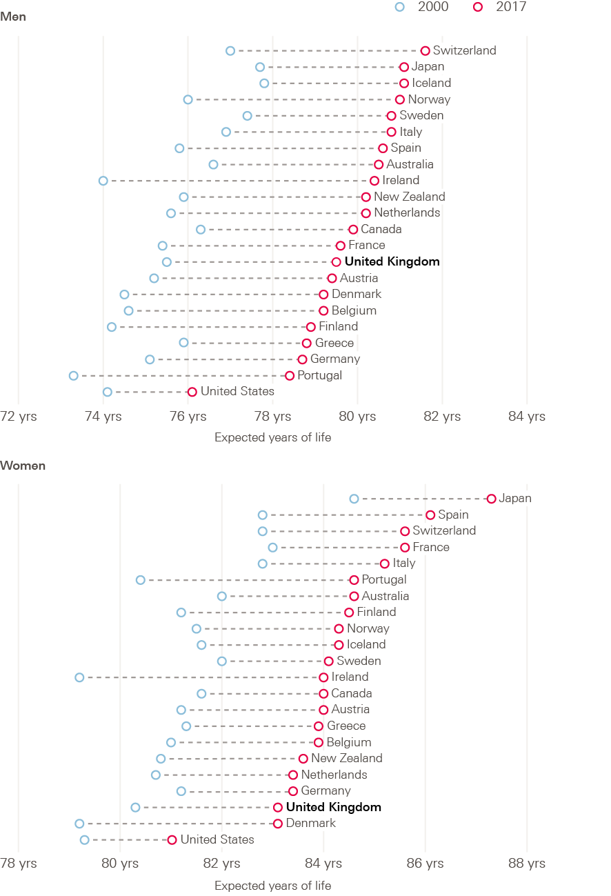
Source: OECD, Health indicators dataset.
In response to the debate about mortality trends, the Health Foundation commissioned a team at the London School of Economics (LSE) and Vienna Institute of Demography (VID), led by Professor Michael Murphy, to carry out a literature review of previous research, plus new analyses into mortality trends. The aim was to provide an in-depth picture of what is happening, and a comprehensive critical assessment of the multiple potential drivers of recent trends. The research is the first in a series of research commissions over the coming years to explore current and underexplored population health issues.
Building understanding about mortality trends and drivers is particularly relevant to two large programmes of work at the Health Foundation, both of which aim to inform a long-term approach to improving health and care in the UK:
- the Health Foundation’s ‘Healthy Lives’ long-term strategy to improve people’s health in the UK, which aims to focus policy attention on the wider determinants of health and support long-term action on these to improve health and address inequalities
- a new specialist unit being set up by the Health Foundation working with academic partners across the UK to provide independent projections, research and analysis to help ensure the long-term sustainability of health and social care in the UK. The aim of the unit is to bring about more evidence-based policymaking and a shift in focus towards long sustainability.
This briefing paper is based on the research by Murphy et al. but also draws on other sources, including the review of mortality trends the Department of Health and Social Care commissioned Public Health England to carry out in 2018, and Health Foundation analysis. The Public Health England review was carried out in parallel with the early stages of this research and is referenced in this briefing and full research report by Murphy et al. This briefing focuses on themes of particular interest to the Health Foundation. The full report is available online from the LSE.
What are the trends in mortality in the UK?
Over the 20th century in the UK, mortality rates fell in both sexes, at all ages. Successive cohorts born over this period experienced improvements in survival (Figure 2, which includes cohorts born in the recent past, for which the dashed portion of the survival curves are projections based wholly on assumptions). Of those born around the beginning of the 20th century (1905 cohort), 62% survived to age 60, increasing to 89% of those born mid-century (1955 cohort). This was due to a combination of reasons. Big gains were made in infant survival in the first half of the 20th century, followed by advances in infectious disease control that helped to increase survival rates throughout adult life. In more recent decades, improvements in cardiovascular disease (CVD) mortality through a combination of health care improvements, reductions in smoking and occupational changes have helped improve the proportion of cohorts reaching older ages, with the majority of further improvements in survival rates for younger cohorts anticipated to continue at older ages in future.
Figure 2: Survival curves: England and Wales, selected cohorts 1905–2005
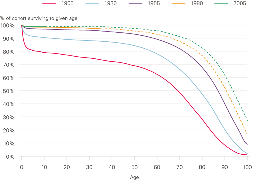
Source: ONS, 2016-based England and Wales lifetable.
Note: - - - denotes projection.
These improvements in mortality led to improvements in life expectancy (derived from mortality data, see definitions in section 2) throughout the 20th century and into the first decade of the 21st (Figure 3). This has been the case in all UK constituent countries, although it is notable that absolute life expectancy differs between countries, England and Wales having the highest life expectancy throughout the period, followed by Northern Ireland, and life expectancy being lowest in Scotland.
Since 2010–2011, mortality improvements have significantly slowed or completely stalled in both sexes and in all constituent countries of the UK, and socioeconomic inequalities in mortality have been reported to be widening. In addition, high mortality in 2015 compared with 2014 caused the largest fall in period life expectancy since the early 1970s. Questions have been raised by academics, policymakers, actuarial analysts and public health experts about the factors that have caused such an apparent deterioration in mortality trends, and about the extent to which the changes are temporary or likely to continue. Finding answers to these questions will have important implications for future policy, pensions and service planning. It will also help to identify action required to foresee and minimise further slowdown or stalling of mortality improvements and widening of inequalities in life expectancy.
Figure 3: Period life expectancy at birth: constituent countries of UK by sex, 1950–2016
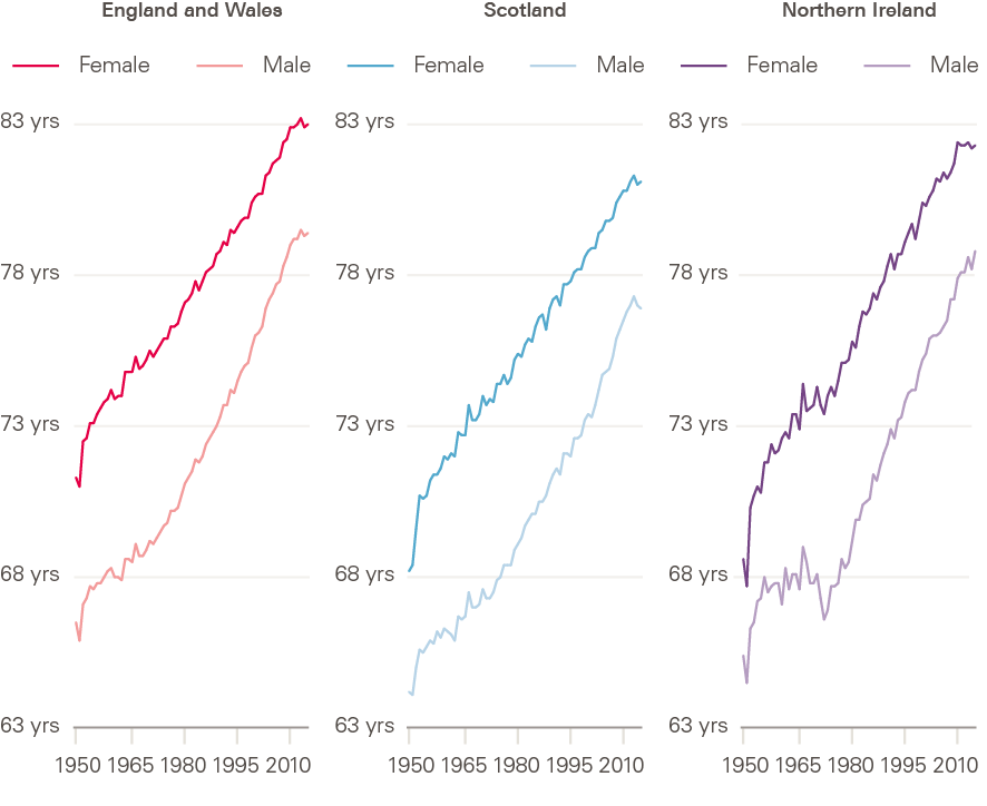
Source: Human Mortality Database; calculations by Murphy, Luy and Torrisi.
What is driving these changes?
There has been insufficient reflection on the complexity of the drivers of mortality trends in the academic and media debate. Conflicting views have been expressed about the relative importance of potential underlying causes. Some contributors to this debate have focused narrowly on the recent changes, without setting the trends in a longer-term or global context. Others have conflated the longer-term trend of stalling improvements in mortality with the observed peaks in mortality, particularly the high levels of excess winter mortality in 2015 and 2018. Most have taken a very narrow view of drivers, addressing them in isolation, and much of the debate on links to austerity has been limited to health and social care cuts. In some cases, attempts have been made to estimate exactly how many deaths may have been attributable to austerity, without always being entirely clear how these estimates were reached or the justification for assumptions made.
The evidence base is therefore limited and inconclusive. The recent Public Health England review of trends in mortality in England concluded that rather than being attributable to any single cause, the slowdown in improvement is likely to be the result of a number of factors operating simultaneously across a wide range of age groups, geographies and causes of death. The Health Foundation concurs with the conclusions of the Public Health England report. A deeper recognition and understanding of the complexity of the factors shaping mortality is now essential if effective policy and action to improve mortality and reduce inequalities are to be identified.
Definitions and methods
This section provides definitions for commonly used measures of mortality and then goes on to describes the analyses carried out by Murphy et al.
Common measures of mortality
Measuring mortality presents a complex challenge. Not only is mortality itself affected by so many different interconnecting factors, but researchers have several different measures at their disposal to understand mortality. Each one can shed light on a different aspect of the overall picture of what is happening in the population.
The conclusion drawn can be influenced not only by the choice of measure but also how the change is expressed. For this reason, it is important to understand the meaning, implications and potential limitations of each measure, to be sure that the measures selected are appropriate to the question being asked.
When assessing the impact of mortality change, the figures can be looked at in one of two ways:
- absolute change – the difference in an indicator between two points in time
- relative change – the absolute change relative to the size of the initial value (change expressed as a percentage of the initial value).
This section sets out the indicators that are most often used when looking at life expectancy and related issues.
Counting deaths in a population
Number of deaths
This is a count of the number of deaths in a population (or population group) in a given period of time. It does not reflect the size or demographic composition of the population in any way. In the UK, the vast majority of deaths occur in older age, so the total number of deaths in a population will be strongly driven by these figures (Figure 4).
Crude death rate
This is a measure of the number of deaths per year in a given population relative to the size of the total population. It is usually expressed as deaths per 1,000 people. It adjusts only for overall size, and takes no account of the age structure of the population. This means that (as with the number of deaths, above) in the UK it is strongly driven by the older age groups, as this is the age at which most people die (Figure 4).
Figure 4: Distribution of deaths by age and sex: England and Wales, 2018
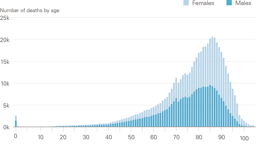
Source: ONS, Deaths registered in England and Wales, 2018.
Comparing mortality rates
As overall mortality in a population is strongly influenced by the age and sex structure of the population (Figure 4), these influences need to be understood and removed to allow appropriate comparisons between times or different populations or groups. This is done by calculating mortality rates. Two types of mortality rate are referred to in this report:
- Age-specific mortality rate
This is the total number of deaths per year, expressed as per 100,000 population within a given age or age group, most usually expressed for men and women separately. Age-specific rates provide understanding of the different mortality experiences of different age groups, and can be used to explore how this changes over time or between different populations.
- Age-standardised mortality rate
As the crude death rate is strongly influenced by the age distribution of a population, age-standardised mortality rates are commonly used to allow comparison between whole populations in different areas or time periods, taking account of differences in size and age distribution of those populations.
The age-standardised mortality rate is calculated as a weighted average of the age-specific mortality rates – in other words, the average is scaled to take away the effect of differing age and sex structures in different populations. This scaling is done to a fixed standard hypothetical population (such as the European Standard Population) and enables comparison of whether and how mortality would differ in two or more geographical areas or timepoints if they had the same age and sex make-up. Without this adjustment, one population could appear to have much higher overall mortality rates than another with comparable age-specific mortality rates at all ages, simply due to having a higher proportion of older adults.
Survival rates
This term describes the proportion of people in a group who are alive after a given period of time.
Life expectancy
Life expectancy is a statistical measure of the average time someone is expected to live, based on the mortality rate they subsequently experience. Life expectancy and age-standardised mortality rates are both summary measures, using the same data (age and sex-specific mortality rates). So, they are alternative ways of summarising mortality rates in a given period, and they mirror each other.
Life expectancy is used for setting the state pension age, and setting and assessing health policy, among other purposes. It is often presented at one of two ages:
- at birth – how long someone born in a given year and place is expected to live
- at age 65 – how long someone at this age in a given year and place might have left to live.
The UK’s life expectancy projections (both period and cohort) are currently produced by the Office for National Statistics. Life expectancy is calculated using a life table. This shows, for each age, the probability that a person will die before their next birthday. There are two types of life expectancy measure: period and cohort (see the box). They differ based only on changes in mortality over time, as explained below, and would only ever be identical if there were no changes to age-specific mortality rates over time, which is highly unlikely.
Period life expectancy
Period life expectancy represents the average number of years a person would be expected to live, based on the assumption that their likelihood of death at each age throughout life is the same as for the population at a given point in time. There is no account taken of possible future improvements in mortality at each age between cohorts.
So, period life expectancies are useful summary measures for the entire population of a given place and time. They provide an objective way of comparing trends in mortality over time, or between different populations and population subgroups. (This is how they are used in this report.)
But period measures are less useful for predicting lifespans of current or future cohorts. And, like age-standardised mortality rates, changes are influenced by deaths in older people (who are the majority of people who die). Period-based projections of life expectancy are based on assumptions about future changes in mortality and reflect the mortality rates of the entire population in each year.
Period life expectancy may also be distorted by ‘tempo effects’: a bias that may arise if period statistics (such as period life expectancy) are interpreted as a reflection of current mortality patterns, when mortality is changing during an observation period. The impact of tempo effects in the recent patterns in mortality is debated, but explored in detail in by Murphy et al.
Cohort life expectancy
In this measure, ‘cohort’ means a group of people born at the same point in time. Cohort life expectancy takes into account age-specific probabilities of death for the specific cohort calculated from observed mortality data, where available, for that cohort. It then combines it with mortality rate projections for the cohort in future years, using assumptions based on historic trends.
This can be used to estimate how much longer a person of a given age and sex, in a given place, would be expected to live. However, these measures tend to rely more heavily on assumptions about the future and predictions are unlikely to be correct.
Historic revisions in life expectancy
Historic estimates of both period and cohort life expectancy have been successively revised as actual changes in mortality have been measured. For example, around 1970 improvements in mortality were close to zero. This led some experts at the time to assume that the highest possible life expectancy had been achieved. This is reflected in the low improvements assumed in the 1971-based life expectancy projections (Figure 4).
We now know that this was not the case. In fact, mortality started to improve at a generally increasing pace throughout the rest of the 20th century. Later commentaries suggested this slowdown in improvements around early 1970 was mainly due to stalling of mortality improvements in cardiovascular disease, especially among older men, including those of higher working age. This may have been due to a combination of higher-fat diets, more sedentary lives and heavy smoking.
Throughout the 2000s, when mortality was improving at a faster than expected pace, cohort life expectancy tended to be underestimated. Conversely, since 2010 – when the slowdown began – it has been overestimated. These overestimations have led to subsequent downward revisions in how much longer future cohorts are expected to live, although their lifespan is still expected to be longer than that of previous cohorts.
Figure 5 illustrates historic estimates of period life expectancy, and how these have been revised as actual changes in mortality have been measured over time.
Figure 5: Successive projections of period life expectancy at birth, males: UK, 1966–2030
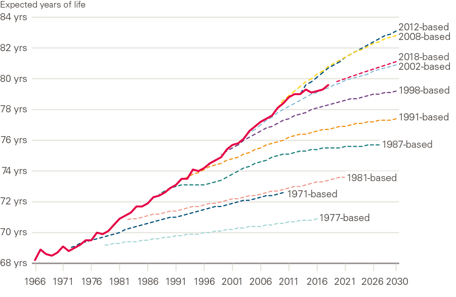
Source: ONS National Population Projections Accuracy Report underlying data, UK, 1966 to 2030; expectation of life, principal projection, United Kingdom, 2012-based, 2014-based and 2018-based.
Healthy life expectancy
Healthy life expectancy is an estimate of the average number of years someone would live in a state of ‘good’ general health, usually expressed at birth or at age 65. Healthy life expectancy adds a ‘quality of life’ dimension to estimates of life expectancy, dividing it into time spent in different states of health. Health status estimates are self-assessed, based on respondents’ answers to a survey question asking ‘How is your health in general?’.
This report focuses on life expectancy, but healthy life expectancy – and inequalities in this – are of critical importance as measures of population health. Inequalities in healthy life expectancy are wider than in life expectancy, meaning that with increasing levels of deprivation, people are living a greater proportion of shorter lives in poor health. This is the focus of other Health Foundation work.
Having described the most commonly used measures of mortality, we go on to look at the new analyses of mortality undertaken in the research by Murphy et al.
New analyses of mortality trends in the UK
Murphy et al. carried out a comprehensive review of previous research into the recent trends in mortality in the UK, covering what had previously been published on the trends and potential drivers of these trends.
This review identified areas where further research would build understanding of the trends and potential drivers, and new analyses were carried out. These analyses primarily used data from the Human Mortality Database – an open-access resource providing detailed and consistent population and mortality data for 40 countries or areas. This enables long-term and international comparisons of mortality. For full detail of the research see the full research report.,
Analyses included the following:
Exploration of mortality trends in the UK
To comprehensively describe the trends in UK mortality rates and life expectancy, the report looks at these in the context of a longer-term picture, as well as in more detail in recent periods.
- Long-term changes in age-standardised mortality rates and period life expectancy in the UK overall and constituent countries, by sex, from 1950 to 2016. In order to understand current trends, this is a relevant period to examine, beginning after the rapid transition in leading causes and ages of death that occurred in the early part of the 20th century (Figure 2), and to exclude the first and second world wars.
- Changes in age-standardised mortality rates and period life expectancy over the 21st century, by sex, from 2000 to 2016. These analyses focused on the 21st century, 2000–2016, with the aim of better understanding the change in trend during this period. Further analyses looked at 2006–2016 to examine the decade around the change in trend and explore the differential impact of the slowdown in different age/sex groups. (This is the period used in most analyses to date.)
International comparisons of mortality trends
To provide additional insight, the report explores differences and similarities in mortality trends between the UK and other countries with similar socioeconomic structures and mortality levels.
For cross-national European comparisons, the authors mainly used the set of high-income countries largely located in western Europe that were considered to provide the most appropriate comparators for the UK. These countries are the European countries defined as ‘developed economies’ according to the MCSI Index.
They included the USA due to considerable interest in recent mortality trends there, and Australia and Japan as examples of high-income countries in other parts of the globe. The HMD provides mortality data separately for England and Wales, Scotland and Northern Ireland, treated in a consistent way with the other countries included. The following analyses were carried out:
- Comparison of life expectancy at birth in the UK and selected comparable countries, by sex, from 2000–2016 The ranking and change in ranking over the period were looked at, plus the UK position for men and women relative to the EU average.
- Changes in age-standardised mortality rates in selected comparable countries, by sex, from 2000–2016 Remaining with this period of particular interest during which the changes have occurred in mortality trends, these analyses were to identify similarities and differences between countries, and the time point at which trends changed.
- Changes in age-standardised mortality rates by age for the UK and closest comparable countries (Netherlands and France), 2000–2016 To further understand similarities and differences by age group, annual percentage changes in age-standardised mortality rates for age groups were plotted.
Further analyses were then carried out to explore some of the possible causal factors identified in the literature review – particularly focusing on the UK, the Netherlands and France. These included austerity-related and other measures, including:
- gross domestic product (GDP), government spending and spending on health care as a percentage of GDP
- spending on health care per capita
- self-assessed health
- obesity prevalence
- age-standardised mortality rates for CVD and non-CVD causes.
Other contributing factors explored included the positive contribution of the ‘golden cohort’ – born between 1925–1935 – to mortality trends, and also the possible role of tempo effects (see definition above).
Mortality trends in the UK – what has happened and who is affected?
UK and international mortality trends in the 21st century
Rapid improvements in mortality rates seen in the UK followed by stalling
In all constituent countries of the UK, mortality rates for both men and women were improving rapidly, at an average rate of three months a year, during the first decade of the 21st century. Since 2011, these improvements have slowed, and even completely stalled in some segments of the population (discussed later and shown in Figure 11).
Figure 6 shows the actual age-standardised mortality rate in England and Wales for each year 2000–2018 (at the time of writing, data was not available to 2018 for the whole of the UK) and how the trend in improvements changed at the turn of the decade. Trend lines are fitted for the periods 2000–2011 and 2011–2018, and show that during the first period, age-standardised mortality rates fell by 26 deaths per 100,000 of population a year. During the second period, these improvements slowed dramatically to just under 2 deaths per 100,000 of population a year.
Figure 6: The changed trend in mortality rate improvements: England and Wales, 2000–2018
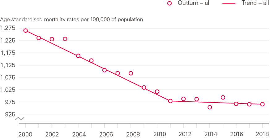
Source: Health Foundation analysis using ONS, Deaths registered in England and Wales, 2018.
As discussed above (and shown in Figure 1) this is particularly concerning given the relatively low absolute levels of life expectancy in the UK, in particular for women. In 2017, life expectancy for women was 83.1 years, putting them near the bottom of the list of comparable countries; for men this was 79.5 years, placing them around the middle of the group but with ample room for improvement.
Some slowing had been predicted by experts for a number of reasons including declining gains to be had from recent reductions in CVD mortality, and increasing obesity in the population. What has occurred has happened sooner and faster than anticipated, sparking debate about the reasons and downward revision of models used to project mortality trends for purposes such as population and pension forecasts.
While this slowdown in mortality improvements has been widely reported and validated, much of the previous research and debate has focused on the increase in numbers of deaths between 2014 and 2015, which was substantial and drew much attention. As can be seen in Figure 6, while mortality was high in 2015, 2014 was a year in which there was exceptionally low mortality, which also contributed to the between-year difference.
This briefing is most concerned with the slowdown of the long-term positive trend in the rate of mortality improvement and life expectancy, rather than specific annual peaks or troughs. Of course, Figure 6, in showing the trend for the population as a whole, masks differing patterns among different population subgroups, which have not been highlighted in the previous research into the slowdown. It is particularly important to understand the slowdown or stalling in UK population subgroups, by sex, age and deprivation. This briefing explores recent trends by subgroup, but first considers the population-level trend in the context of longer-term and international experiences of mortality.
The slowdown follows a long period of improvement in the UK
Improvements in mortality in the UK go back many years. Figure 7 shows standardised death rates in constituent countries in the UK from 1950 to 2016 (the period for which data is available in the HMD). Since the 1950s, there have generally been steady improvements in age-standardised mortality rates in both men and women, across all constituent countries of the UK. The period 2000–2009, ahead of the 2010–2011 stalling, showed particularly strong improvements in the context of longer-term changes, with reductions in age standardised mortality rates of 2 to 3% per year.
It is notable that over the full period looked at, while trends have been similar across UK countries, mortality rates have been considerably higher in Scotland than England and Wales, and Northern Ireland.
Figure 7: Long-term changes in age-standardised mortality rates by sex: constituent countries of UK, 1950–2016
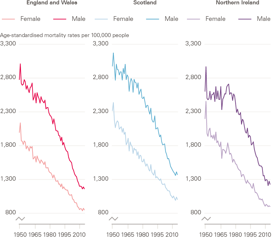
Source: Human Mortality Database; calculations by Murphy, Luy and Torrisi
The slowdown is widespread internationally, but pace and timing vary
Comparing what is happening in the UK with other similar countries can provide insight into what may – or may not – be driving the slowdown. If trends are very similar internationally, factors specific to the UK would be less likely candidates. If trends are similar but not identical, there may be common general drivers, with local factors explaining deviation from a common international pattern.
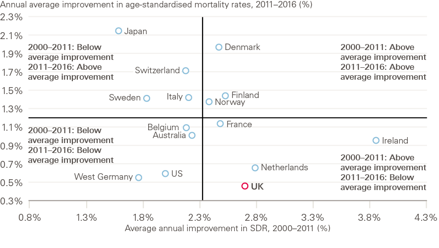
Improvements in mortality have slowed across most comparable western European countries, and the USA (Figure 8, and section 2.2 for selection of comparable countries). The slowdown has been most rapid in the UK though, with a more gradual decline from historically high rates of improvement seen internationally (with the exception of Ireland). The average annual improvement in the UK was 73% lower in the 2011–2016 period compared to the 2000–2011 period. On average, it was 40% lower for a selection of comparable countries.
Figure 8: Total improvement in age-standardised mortality rates: selected countries, 2000–2011 and 2011–2016
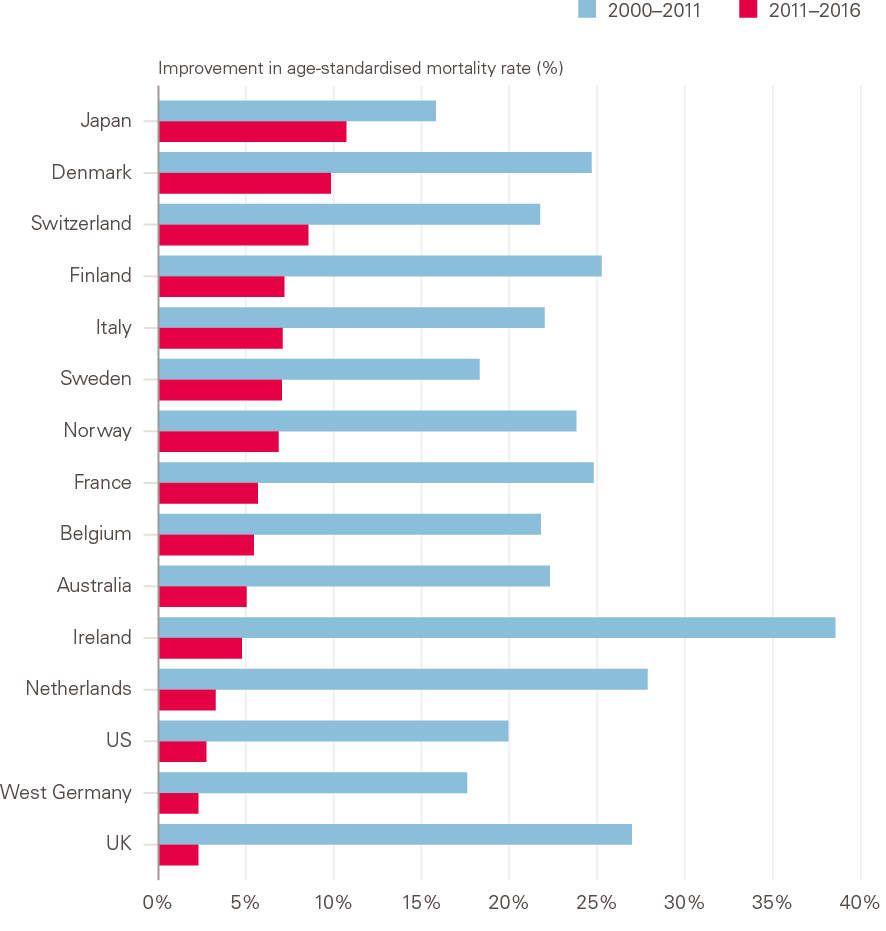
Source: Human Mortality Database; calculations by Murphy, Luy and Torrisi
Notes: Data for Australia, Ireland, Italy and Norway are to 2014, for Switzerland and Finland to 2015.
Intriguingly, all constituent countries of the UK show a similar pattern, including Northern Ireland, while the Republic of Ireland is closer to the continental western European pattern.
Further analysis by the LSE showed differences between the UK and comparator countries in when the change in trend occurred. The slowdown appears to have happened both later and faster in the UK than in the comparator countries looked at, which generally saw a change in the rate of improvement from around 2005, up to 5 years earlier than the UK. The most similar country to the UK over the full period is the Netherlands: levels of mortality as well as the magnitude and timing of change were all very close (Figure 9).
The large increase in mortality seen in the UK between 2014 and 2015 also coincided with similar fluctuations in most European countries. As in the UK, older people, especially women, were most affected by excess deaths in 2015. This resulted in annual changes in life expectancy at age 65 in 2015 being negative for women in 25/28 EU states, and for men in 16/28.
Figure 9: Average annual changes in age-standardised mortality rates: selected countries, 2000–2011 and 2011–2016
Source: Human Mortality Database; calculations by Murphy, Luy and Torrisi
Notes: Data for Australia, Ireland, Italy and Norway are to 2014, for Switzerland and Finland to 2015.
The rate of further improvements in life expectancy in the UK has fallen faster than most other countries
Annual improvements in life expectancy in the UK since 2011 have been particularly low among comparable countries. This is especially concerning given the UK already had a lower level life expectancy than many similar countries prior to the slowdown, in particular for women (Figure 1). The low rate of improvement in UK life expectancy at birth in 2011–2016 for both men and women is in contrast to the previous period 2006–2011, when UK improvement rates were among the highest among comparable countries, with UK women having the largest improvement of all countries looked at over the period 2006–2011, albeit starting from a particularly low level relative to other countries (2006–2016 is the most recent decade for which comparable international data is available in the HMD). It must also be borne in mind that a slowdown was already being experienced by other countries during the period 2006–2011.
Despite the earlier start to the slowdown in other comparable European countries looked at, for the majority (14/15, the exception being Norway), life expectancy at birth still increased more slowly between 2011–2016 than it did between 2006–2011. This highlights the widespread and ongoing nature of the slowdown during this second decade of the 21st century. None of the comparator countries experienced the sustained period of strong improvement lasting throughout the 2000s that was seen in the UK, and while a reduction in rates of improvement has been widespread, a consequence of the particularly high initial rates of improvement means that the UK exhibits a more marked change of trend.
There is room for improvement: the UK has a relatively low life expectancy
While comparison with other western European countries may provide evidence against the case for UK exceptionalism that has previously been made, it is no argument for complacency. In terms of life expectancy at birth, the UK is doing worse than many other comparable countries, in particular for women (Figure 1).
Sex-specific trends in mortality
The life expectancy gap between men and women in the UK has narrowed
Women have historically had a longer life expectancy than men in the UK, but the gap has changed over time (Figure 10). This female advantage widened until around 1970, and then narrowed to the present day, with men improving faster than women over the last 50 years to ‘catch up’. The narrowing of the gap between 1970 and the 1990s has been associated with improvements in CVD mortality, which historically had a greater impact on men, and – not unrelated to CVD – much higher levels of smoking among men in the early period, followed by greater reduction in smoking in men than in women, plus declining numbers of men in high-mortality occupations. Analysis of more recent trends, driven by an ageing population with multiple conditions, requires a more sophisticated understanding of diagnosis and coding, and of the interrelationship between the condition or event causing a death, and the underlying contributors that ultimately led to the death.
Figure 10: Male–female differences in period life expectancy at birth: UK 1950–2016
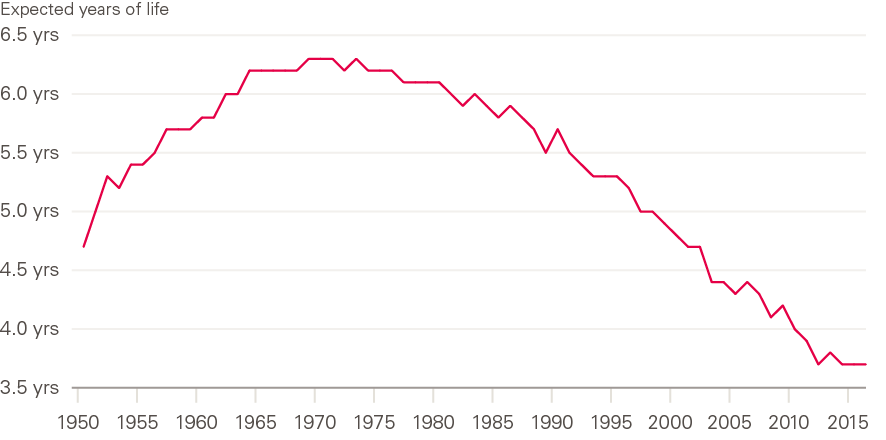
Source: Human Mortality Database; calculations by Murphy, Luy and Torrisi
The LSE research found that there has been little, if any, improvement in mortality among women in the period 2011–2016, while men have continued to improve at a slow rate (Figure 11). This has been in the context of male life expectancy that is comparable with European peers, but a female life expectancy that is among the lowest, meaning that UK women are falling further behind from an already low starting position over this period.
As shown in Figure 10, the male–female gap in life expectancy has been narrowing since around 1970, due to male life expectancy increasing faster than female. Since 2011, and the population-wide slowdown in the UK, this has been reflected in very slow improvements for men and no improvement for women. Certain subgroups have fared particularly badly, and gaining a better understanding of what is happening requires detailed exploration by age, sex and socioeconomic group.
Figure 11: The changing trend for age-standardised mortality rates by sex: England and Wales, 2000–2018
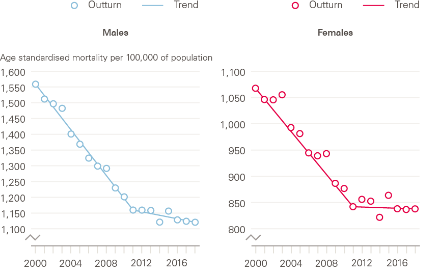
Source: Health Foundation analysis using ONS, Deaths registered in England and Wales, 2018.
The narrowing male–female gap in life expectancy is widespread
As in the UK, the improvement in male life expectancy at birth was higher than that for females over recent years in comparable countries. As a result, the male–female gap in life expectancy at birth in the UK narrowed by just under 1 year between 2006–2016 (Figure 10). While there was variation between countries in the extent to which this male–female gap closed over this period, there does not appear to be a markedly different pattern between the sexes emerging in recent years. Life expectancy improvements for women have approached zero, ahead of men, as they had been improving at a lower rate ahead of the slowdown. It must also be noted again though that UK women are doing particularly badly internationally in terms of both their absolute level of life expectancy and their current (zero) rate of improvement.
Age-specific mortality trends
The slowdown in improvement in mortality rates at older ages has dominated trends, but they are not the only group affected
In the UK, as in comparable high-income countries, recent trends in mortality at the population level have been determined primarily by changing mortality patterns in older age groups, where most deaths now occur. LSE analysis shows that all age/sex groups showed improvements between 2006–2011, but particularly the 70–84 age group (Figure 12). In the later period, 2011–2016, mortality improvements were reduced and low for all groups, but particularly women aged 85 and above, who experienced some worsening, and men and women aged below 50, in which zero improvements occurred.
Figure 12: Age-standardised mortality rates by sex and age group: UK, 2006–2016
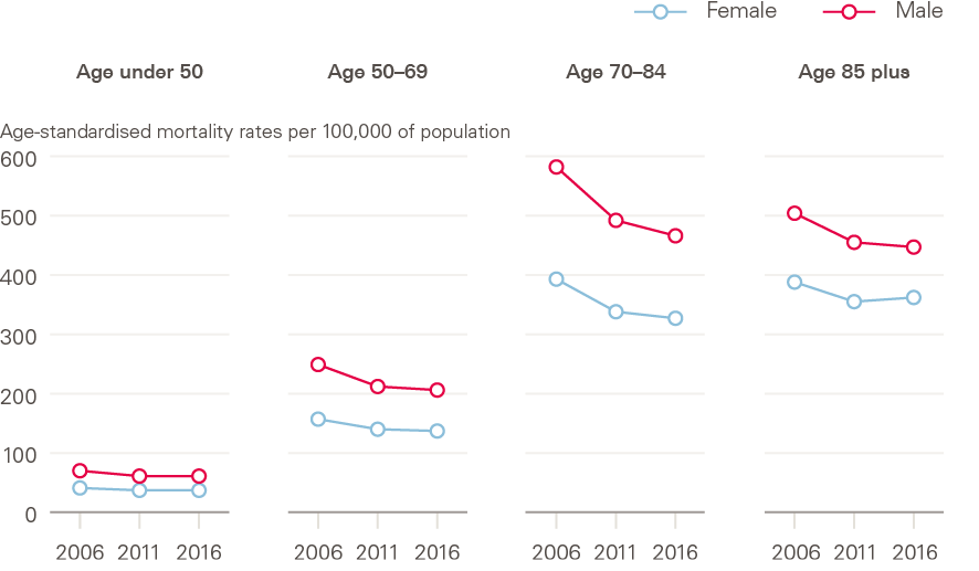
Source: Human Mortality Database; calculations by Murphy, Luy and Torrisi.
Improvements in mortality rates are also stalling at younger ages in the UK
Mortality improvements are stalling at younger ages in the UK. In recent years, both men and women aged 35–50 in England have experienced lower mortality improvements than in the 2000s and in some cases mortality rates have actually increased. For instance, mortality rates fell for 45–49-year-olds by an annual average of 5.4 people per 100,000 of population between 2011 and 2006, but increased by an annual average of 1.1 people per 100,000 of population between 2001 and 2016. This is highly concerning and, while this group makes only a limited contribution to overall trends, needs further attention.
The negative trends in this age group have been attributed to increases in accidental poisoning arising from drug misuse, alcohol consumption and suicide (termed ‘external causes’ of death). This pattern of causes looks similar to those in the USA that are affecting young adults, to the extent that they have impacted on life expectancy in the population. In the USA, deaths due to accidents, misuse of opioids and risky behaviours – termed ‘deaths of despair’ – have led to an increase in mortality in young adults. In the USA, following some years of declining improvements in mortality, the first fall in life expectancy in the population since the 1993 HIV/AIDS epidemic was seen in 2015, followed by further falls in 2016 and 2017. The USA now sits at the bottom of rankings of comparable countries for both male and female life expectancy, and this is primarily as a result of increasing mortality among middle-aged adults, rather than at older ages.
The UK pattern for deaths in younger adults is divergent from mainland Europe
As in the UK, deaths at younger ages account for only a small fraction of all deaths in Europe. As deaths tend to be concentrated around age 80, the trends in the oldest age groups dominate overall mortality trends in the population, but detailed international comparisons by age group are worrying. While the slowdown in the population overall and at older ages in the UK is similar to its closest comparators, the Netherlands and France, the stalling of improvements in younger adults (up to age 50) that is discussed above is unique to the UK among these countries. Mortality rates in the under 50s continue to improve year-on-year in the other countries shown (Figure 13).
This highlights how looking solely at the population overall can mask important trends in subpopulations that do not contribute high numbers of deaths overall. Identifying subgroup-specific trends is important in elucidating what may be driving the trends in that group, which may be distinct from other drivers of population trends.
Figure 13: Improvements in age-standardised mortality rates by age group: UK and neighbouring countries, 2000–2016
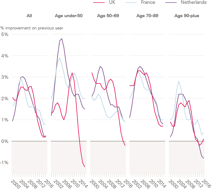
Source: Human Mortality Database; calculations by Murphy, Luy and Torrisi
Socioeconomic differences in mortality trends
Socioeconomic differences in mortality have increased since around 2010, following a period of decreasing inequalities
Wide socioeconomic inequalities exist in the UK in both life expectancy and healthy life expectancy (the number of years that someone can expect to live in good health). In England, life expectancy for women in the lowest decile for deprivation is 7.5 years lower than for those in the least deprived decile (78.7 years vs 86.2). The gap is even greater for healthy life expectancy, at 18.4 years (52.0 vs 70.4), meaning that women in the most deprived decile can expect not only to live shorter lives, but to live a greater proportion of their life in poor health.
Studies assessing the impact of deprivation in mortality improvements over recent years, using differing datasets and methodologies (both ecological analyses using small area-level indices of deprivation, and analyses of individual-level data held for pension and insurance schemes), generally point in the same direction – that socioeconomic differences in mortality have increased since around 2010, following a period of decreasing inequalities (Figure 14).
Figure 14: Period life expectancy at birth by sex and local area deprivation: England, 2011–2013 to 2015–2017
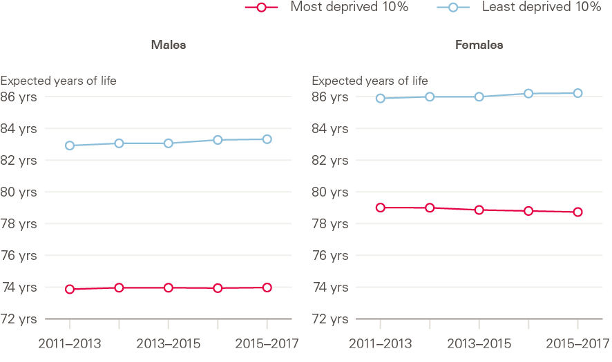
Source: ONS Health state life expectancies by deprivation decile, England, 2011/2013–2015/2017.
Improvements in mortality among lower socioeconomic groups are lagging behind those in higher socioeconomic groups
Since around 2011, women in the most deprived areas have experienced decreases in life expectancy, while life expectancy for men in the most deprived areas has stalled. For both sexes, life expectancy has continued to improve in the least deprived areas (Figure 14). Failure of the most deprived groups to match the ongoing (albeit slowing) improvements of the higher socioeconomic groups has widened inequalities in life expectancy that had previously been reducing. This life expectancy advantage in the least deprived is in large part due to later onset of multimorbidity, and subsequent longer survival, compared with the least well off. These differences are only in part explainable by socioeconomic differences in smoking prevalence. Other factors that contribute to the development of multimorbidity, including obesity and smoking, also show wide socioeconomic inequalities.
Trends in the leading causes of death in the UK
Leading causes of death in the UK
The leading causes of death in the UK are age-dependent. Leading causes in the population overall are therefore driven by those affecting older age groups, who contribute most deaths. Given the concerning trends in young as well as older adults, understanding what people in the different age groups are dying from is important. The leading causes of death in England and Wales in 2017 by age group (20+) are shown in Figure 15.
Figure 15: Top five causes of death by age, England and Wales, 2018
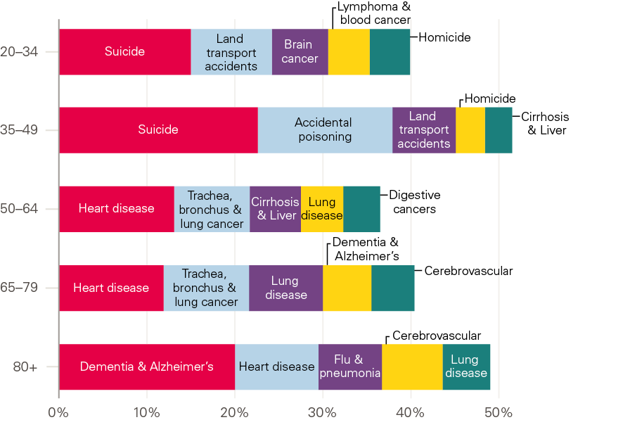
Source: Health Foundation analysis using ONS, Deaths registered in England and Wales, 2018.
Mortality improvements occurred in most leading causes of death prior to the slowdown
Over the first decade of the 21st century, when mortality rates were improving rapidly in the UK population, mortality improvements occurred in almost all leading causes. Improvements in CVD were particularly significant. This was due to a combination of factors: improvements in surgery, increased use of medication to lower blood pressure and cholesterol, and lower rates of smoking. Since 2011 however, CVD improvements have slowed, due to lessening impact of improvements in these contributory factors plus, most likely, increases in other risk factors in the population including poor diet, obesity and type 2 diabetes. Reductions in the pace of improvement of cancer – the other main set of causes of death – also occurred, but at a much lower rate than CVD.
Much attention has been paid to the role of both influenza (flu) and dementia over the period of the slowdown. With both, the challenges of establishing and assigning causation of death in older individuals who commonly have multiple conditions must be borne in mind.
Flu is rarely recorded on death certificates as an underlying cause. Instead, models for estimating the scale and spread of flu outbreaks use multiple sources of data. Dementia is now the most commonly coded leading cause of death in older people. While this is in part due to population ageing and improvements in treatment for other conditions, changes in diagnosis, definitions and coding practices have also contributed to the increase over the past 5 years. The increase in dementia coding as a leading cause may also be leading to underestimation of what is happening with CVD and respiratory causes over recent years, as deaths that may previously have been coded with these as a leading cause may have been attributed primarily to dementia (Figure 16).
Figure 16: Change in the top five leading causes of death, females all ages: England and Wales, 2011–2017
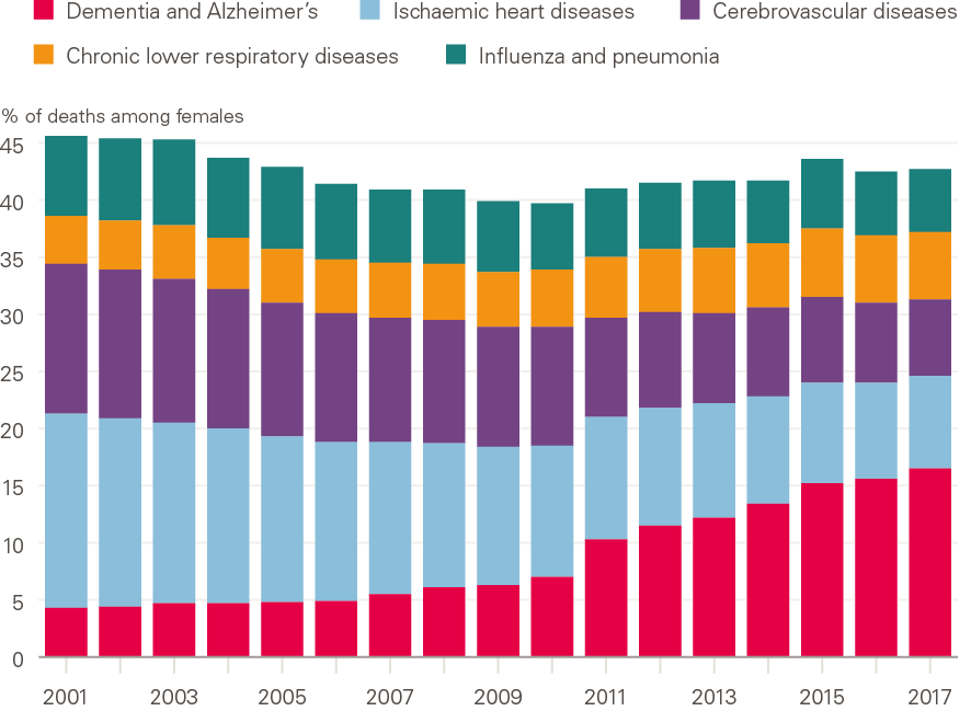
Source: ONS, Deaths registered in England and Wales (series DR), 2017
Note: Changes to how diseases were coded occurred between 2011 and 2014.
Drug-related deaths and suicide have been increasing in younger adults
Drug-related mortality rates (and numbers of deaths) – which include deaths from prescribable drugs – have increased greatly in the UK in recent years, most markedly at ages 30–49. However, the rate differs markedly across the constituent countries and the regions of England. The rate of drug-related deaths in Scotland in 2018 was the highest it has ever been, making it – as widely reported in the media – the highest in Europe and on a par with the USA (at 218 deaths per million population vs 217 per million population in the USA – 2017 data – for the populations overall). England and Wales have much lower rates, but 2018 saw both the highest level and greatest annual increase (16%) since records began in 1993. Although rates are far lower in England and Wales than Scotland, there is significant variation within these. The rate was highest in the North East of England, at 142.7 deaths per million, and lowest in London, at 56.5 per million. Rates were also high in Wales, the North West, and Yorkshire and the Humber.
The leading cause of death in younger adults is suicide. Suicide disproportionately affects men, with rates three times higher than women in the UK. While the overall male suicide rate decreased to the lowest level in over 30 years in 2017, this masks an increase in suicide rates in younger men across the UK, with an increase of 7.4% between 2016–2017 in men aged 45–49. It should be noted that there are issues inherent in the coding of suicide vs accidental poisoning, in particular with drug-related deaths and, for some groups of the population, looking at rates and change in rates for suicide mortality is not reliable due to relatively low numbers of deaths.
Are current patterns indicative of future trends?
From the analysis of UK mortality trends, it still is not known whether current trends represent a long-term shift from improvement, or a short-term deviation from a norm of continuing improvement, and caution must be applied in drawing conclusions based on short-term changes. Recent data indicate some rapid and unexpected improvement in mortality in England from mid-2018, continuing into early 2019. These are very recent – and very short-term – changes, coming after the unusual period of slow improvements, and do not provide a good basis for drawing conclusions about underlying trends, or what may happen in future.
The last period of sustained low improvements or even reversals in the UK was in the 1970s, and this was followed by a long period of improvement. Examples from other countries provide some cause for optimism. Japan showed little improvement in mortality in the first decade of the 21st century, when other countries at similarly high levels of development were improving rapidly, and there was a view that maximum life expectancy had been reached. However, in the most recent period Japan has shown very high rates of mortality improvement.
Examples of sustained poor performance are rare, although the USA experienced this in relation both to earlier periods and other high-income countries. Life expectancy in the USA has fallen in each of the last 3 years for which data is available (2015–2017). This has only happened once in the past century, in the exceptional period between 1915–1918 (World War I). There are no other documented cases of long-lasting increases in mortality in developed countries, other than the Soviet Union between 1960–1995 (this is discussed in detail by Murphy et al.).
What is driving the current trends?
Following the analyses summarised in the previous section, Murphy et al. critically assessed putative factors contributing to the recent trends, based on the research reviewed plus further new analyses (described in full by Murphy et al. in 2019).
The trends point to multiple, complex drivers
The recent Public Health England review of mortality trends in England, carried out in parallel with the early stages of this research, concluded that:
‘the main findings suggest that the overall slowdown in improvement is due to factors operating across a wide range of age groups, geographies and causes of death… It is not possible to attribute the recent slowdown in improvement to any single cause and it is likely that a number of factors, operating simultaneously, need to be addressed.’
So, while the overall slowdown of improvement in mortality rates in the population points to a global driver or drivers, the fact that the trend is not consistent across population subgroups (with women, deprived groups and younger adults being most affected) suggests that these drivers do not act equally on all groups, and also – given the leading causes of death are very different in older and younger adults – that there are additional specific drivers at play. Thus, it is most likely that both common and specific drivers are acting in a complex interrelationship. This complexity needs to be taken into account in seeking to better understand the drivers of recent patterns in mortality.
It is important to assess the plausibility of the contribution of different possible drivers alongside each other, as done by both the Public Health England review and this research (discussion of different theories posited by Murphy et al. is included in Table 1, based on findings of their review of the literature (including the Public Health England review) and further new analyses described in full by Murphy et al. Understanding the relative contributions and complex interactions between factors is, however, far more difficult, and requires further attention.
Consider the complex system of determinants of mortality
A number of previous reports have attempted to investigate the role of austerity in recent mortality trends, given the aligned timing and plausibility of this as a contributor. However, these have largely focused on health and social care cuts and consequent falls in performance, with wider aspects of austerity not being paid much attention. The commonality of mortality trends in different countries despite very differing experiences of austerity (in terms of which budgets have been cut and when, and how severe the cuts and resulting impact have been) would suggest that a single definition of ‘austerity’ cannot fully explain recent patterns. Furthermore, some of the countries that have experienced the greatest austerity have not seen slowdowns as great as those that have had little or no austerity policies.
Further analysis to assess whether there is any association between the timing of the slowdown (as discussed above, this varied between countries) and the implementation of austerity policies would be informative, as would examination of the detail of the specific policies in different countries, including which services were prioritised for protection from cuts.
There has also been some examination of other potential drivers, including migration, the ageing population, data and statistical artefacts, and ‘harvesting’ effects of deaths being shifted between periods (either brought forward or shifted back, as even if a death is postponed, people will die eventually). However, none of these alone can explain trends.
It should not be surprising that no single plausible driver of the recent mortality trends has been identified. Health and mortality emerge from a complex system of interrelated influences. As set out in the recent Public Health England review of mortality trends, understanding what is happening to mortality in the UK will therefore require a developed understanding of the multiple positive and negative influences on health, the interrelationships between these, and the pathways by which putative drivers may interact and effect changes.
For example, austerity and flu have largely been considered individually, however their impact is not likely to be completely independent. They arise for very different reasons and have very different implications, but plausibly interact in their pathways of action. Theoretically, cuts to health and social care service funding and high prevalence of flu in older adults could jointly contribute to pressure on services, and the ability of services to respond to any increase in demand, potentially jointly resulting in unmet need for health and social care among frail older adults and increases in mortality. Previous analyses attempting to estimate the impact of each separately may have sometimes therefore conflated the effects. An additional theoretical example is that trends in CVD mortality and cohort effects may be more appropriately understood as not being entirely distinct from each other, as different cohorts will have very different profiles of exposure to risk factors. Attempts to understand interactions between these and other drivers are needed.
Murphy et al. concluded that a framework is needed to consider the complexity and interrelationships between different drivers and their pathways and impacts, and that this needs to take account of short, medium and longer-term drivers, and the differing time to impact that these have. For instance, flu has undoubtedly contributed to annual fluctuations, such as the spike in 2015, but other intertwined and slower-acting factors are acting concurrently at different levels in different groups to result in the observed slowing or stalling of mortality improvements.
Furthermore, there are complex cohort effects, and the timing of events and exposures over people’s lives may be an important aspect to consider. Individuals in their 80s–90s in 2016 belong to the ‘golden cohort’, born 1925–1935. This cohort experienced a higher rate of mortality improvements than those born before or after them. The reasons for this are not fully understood, although the most commonly cited theory is changing smoking patterns between cohorts. Other hypotheses include: better diet and environmental conditions during and after World War II, including better foetal and early life environment; improvements in food preparation and packaging in the 1920s–1930s; a competitive advantage from being born in a low fertility period; and benefits from the introduction of the welfare state in the late 1940s, or from medical advances. Given that the reasons for the high levels of mortality improvement seen in this cohort are not understood, it is not known whether their relative advantage will continue into the oldest ages, or what will happen when following cohorts come to dominate mortality trends due to reaching the age at which most deaths occur, and thus take a more dominant role in driving trends, with the declining numbers of the ‘golden cohort’ having less influence on overall trends.
Looking at causes of death will not by itself lead to a solution
There has been some examination of single causes of death, in an attempt to understand the trends. As discussed above, examination of single causes of death as contributors to trends is not straightforward, especially at older ages where most deaths occur. There have been ‘real’ as well as technical (including coding) effects, and increases in coding of any single cause would have a knock-on impact on what is not being coded instead. Determination and coding of primary and secondary causes of death is also complex, particularly at older ages when multimorbidity is common.
There have been important, real changes at younger ages in drug-related deaths, accidental poisoning and suicide, but again differentiating between these in establishing cause of death is not always clear.
A problem with looking at single causes is that it provides limited understanding of why changes are happening – particularly given the context of rising multimorbidity – and therefore what can be changed to improve circumstances. The leading causes of death have common risk factors, including smoking, alcohol, obesity, air pollution, poor diet and insufficient physical activity. These risk factors are intimately linked to social and economic circumstances.
For example, cause of death trends from cancers, CVD and respiratory diseases are all in part a consequence of smoking patterns, so examining all three causes separately will provide less insight, especially for policy options, than examining smoking. Furthermore, these risk factors have common drivers and are all socioeconomically clustered, with segments of the population exposed to multiple risks at hazardous levels.
The importance of looking at the ‘causes of the causes’
These common drivers – known as the ‘wider determinants’ of health – are the social, economic, commercial and environmental conditions in which people live. The literature review identified a notable absence of consideration of the wider determinants of health in previous attempts to understand the current mortality trends. However, these circumstances shape people’s exposure to risk factors. For example, understanding the reasons why people smoke or have unhealthy diets can point to important targets for policy action beyond traditional health promotion and prevention services that would, over time, be expected to have wide-ranging impacts on health and – critically, given the social patterning of health and mortality and wide (and widening) gaps in life expectancy and healthy life expectancy – health inequalities. The wider determinants will also be relevant to understanding the concerning trends in younger adults, with both drug-related deaths and suicide being issues of inequality, which are strongly socioeconomically patterned.
Table 1: Discussion of some theories posited as contributing to recent mortality trends (based on the literature review by Murphy, Luy and Torrisi including the Public Health England review, and further analysis by Murphy, Luy and Torrisi)
|
Potential driver |
Scope |
Impact |
|
|
Population and environmental factors |
|||
|
Cohort effects |
National |
Cohort effects have the potential to have a large impact on mortality trends. However, multiple factors may be involved and sufficient data to identify cohort effects in short time periods are lacking to date. The ‘golden cohort’ born between 1925–1934 has received some attention. This cohort has experienced particularly high levels of health and mortality improvement over time compared with prior and later generations, possibly in part due to dramatic declines in smoking. Some argue the slowdown is in part due to the fact that this cohort is now in their 80s and 90s and make a declining contribution to overall mortality rates, and/or their relative advantage has disappeared due to increasing prevalence of comorbidity. They are also the cohort potentially most affected in recent years with high levels of virulent influenza. |
|
|
Population ageing |
National |
Impacts on numbers of deaths, but no direct influence on age-standardised mortality rates or life expectancy. Compositional changes of the population affect unstandardised overall values, if improvement at older ages is lower than at younger ones, and ageing within older age brackets (eg 85+) may impact. However population ageing is a slow-acting process unlikely to cause the sharp rises in mortality observed in recent years. The Public Health England review found demographic changes to have an insignificant impact. There may however be interaction with other contributing factors, including austerity. |
|
|
Weather trends |
National |
As discussed in detail in the Public Health England review, there is no evidence for a secular shift, and individual year effects are small. Excess mortality (especially among deprived older people) linked to temperature, cold homes and fuel poverty has received less attention recently. |
|
|
Social and political factors |
|||
|
Austerity |
National |
The slowdown in mortality improvements and widening inequalities in mortality coincided with implementation of wide-ranging austerity policies. A number of commentators cited cuts to health and social care funding as drivers, including falling NHS performance, and cuts in spending on health and social care. ‘Austerity’ is a broad term that also includes numerous components including standards of living and changes in benefit systems, which have received less attention in terms of impact on mortality. Other studies do suggest wider impacts of austerity, including negative effects on homelessness, mental health and self-reported general health; but without a link to mortality. Looking at associations at area level has not found clear associations, mainly focusing on population averages and temporal associations. Austerity policies are implemented very differently, and will affect individuals very differently, and this detail would be important. It is also impossible to disentangle effects of interrelated changes. Countries that have experienced very different extents of austerity, or differing austerity policies in terms of what is prioritised for protection have seen similar trends, including across UK countries, although looking at the detail of these differences may help explain differences between the UK and other countries, and austerity plausibly has a large impact in explaining between-country differences. There is a need to much better understand the complexity (rather than just considering ‘austerity’ or just ‘health and social care’), and the pathways of impact, in determining whether findings are causal impacts, or whether confounding or coincidence explain them. There are various plausible pathways from austerity to mortality. |
|
|
Migration |
National |
There are complex relationships that are challenging to assess, due to data limitations. Information on mortality by country of birth is not generally available, hindering assessment. Recent migrants tend to be in low mortality groups though, so have very limited possibility of influencing overall values, and the Public Health England review examined this and concluded that the impact was small. Possible effects of the ‘healthy migrant effect’ (migrants tend to be healthier than the average of population they originate from) or ‘salmon bias’ (relating to UK-born returning emigrants, generally at older ages as a result of declining health) have not been considered. The healthy migrant effect is known to decline with time in the host country, and disadvantage may be observed in second generation rather than first generation migrants. A better understanding of migrant effects is needed, considering the changing position of the UK within the EU, and the broader question of the total contribution of migrants to UK mortality trends would need to also consider the role of overseas workers in maintaining the health and social care system. |
|
|
Disease factors |
|||
|
Specific role of CVD |
International |
Slowing of CVD mortality improvement appears to contribute significantly to overall slowing or stalling of mortality improvements, as quantified in the Public Health England review. However, alone it might be expected to have a more gradual effect in slowing mortality. Explanations for the sharp change in trend observed, related to CVD, have not been advanced. In addition, problems exist with recent cause-specific data including due to changes in the coding of dementia. |
|
|
Influenza outbreaks |
International |
There is substantial evidence supporting a large role of influenza in high mortality winters, but the magnitude of annual impact has not been precisely established. Peaks for mortality rates coincided with bad flu years (for the A(H3N2) strain in particular, which is the strain most associated with mortality in older people). |
|
|
Increase in Alzheimer’s disease and dementias |
National |
This has had a small effect on overall trends in mortality. Increases in dementia coding are largely due to increased diagnosis and changing coding practices (although the ONS has provided figures that make it possible to adjust for coding changes), together with population ageing in unstandardised measures. Increased overall prevalence would tend to increase annual fluctuations in deaths. Large reported increases affect the interpretation of CVD effects due to impact on coding of other causes as leading cause of death. |
|
|
Data and analytical factors |
|||
|
Choice of reference period |
International |
The relative and absolute magnitude of mortality stalling depends substantially on the choice of reference period, eg 2006–2011 vs 2011–2016 vs 2006–2016. The interpretation of results is particularly sensitive to the anomalous patterns observed in the first decade of this century. |
|
|
Data artefacts |
National |
Factors considered include the selection of time series used to calculate trends, and the way population size and structure are adjusted for including the population used for standardisation. Revisions to older age groups following the 2011 census are not considered but continue to be monitored for impact. Similarities of trends across countries and data sources means this is unlikely to be an explanator. Both this research and the Public Health England review concluded data artefacts did not contribute significantly to observed mortality trends. |
|
Discussion and implications
What does the analysis tell us?
The improvements in mortality that have been seen over many decades in the UK have slowed or stalled since around 2011. While this slowdown is widespread among comparable high-income countries, it has happened at a greater rate in the UK than most others. As the UK does not compare well in terms of its absolute level of life expectancy, this is particularly concerning.
The population-level trends in the UK, which are driven by the older age groups as this is where most deaths occur, mask worrying trends in certain segments of the population. Women have a lower life expectancy than most comparable countries, and improvements have completely stalled in recent years, in particular in the most deprived areas, as too have improvements in mortality for the under 50s. In this respect, the UK differs from other European countries, where improvements continue to be seen in the younger adult population. This trend is being driven by deaths defined as ‘external causes of death’, including increases in drug-related deaths and suicides in the under 50s, with Scotland seeing rates of drug-related deaths that are comparable to the USA and Canada, which are a result of the opioid crisis in these countries. The increases in England and Wales however also need monitoring and urgent action to prevent further worsening.
Significant differences in mortality exist in the UK by socioeconomic deprivation, and these inequalities have been increasing over the period of the slowdown. While improvements in life expectancy have continued in the most advantaged groups, they have completely stalled in the most disadvantaged. This is widening the gap in life expectancy – in contrast to the narrowing observed prior to 2010. Inequalities also exist by geography, with differences in mortality rates and life expectancy across the UK constituent countries.
Understanding the factors shaping these trends will require an explicit focus on inequalities and subgroups of the population and those trends which, if left unaddressed, could increase mortality and inequalities. These include, but are not limited to:
- obesity: the earlier onset of obesity and its associated comorbidities, and the widening inequalities in childhood obesity
- smoking: the wide inequalities that persist and contribute to inequalities in mortality
- misuse of alcohol and drugs: in particular in disadvantaged groups in parts of the UK.
Trends in mental health have rarely been mentioned in the debate about mortality stalling and demand more attention. Worsening mental health would be expected to affect several causes of mortality across the population. In particular, there needs to be a critical look at the role poor mental health may be playing in the cause of deaths that are found to be behind the stalling of improvements in life expectancy for younger adults.
The population’s health and mortality – and inequalities in these – are driven by social, economic, environmental and commercial conditions: the ‘wider determinants’ of health. These have complex interrelationships and act together to influence health. Thus, the slowdown – and in some cases complete stalling – of improvements in mortality in different population groups is not driven by any single causal factor. As there is no single cause for the slowdown, there will be no single solution – improvement will require a whole-government approach to the wider determinants of health.
What does this mean for government policy?
A healthy population is essential for other aspects of social and economic progress – as recognised by the Ageing Society Grand Challenge in the English government’s Industrial Strategy: to ensure that people can enjoy at least five extra healthy, independent years of life by 2035, while narrowing the gap between the experience of the richest and poorest.
Indeed, a population’s health outcomes can serve as a success measure for government policy – in parallel to, and on an equal footing with, measures of GDP. Given the long lead-in time between decisions that shape people’s health and their impact on outcomes, viewing health outcomes in this way would precipitate an approach to policymaking that is more future focused and takes a broader, longer-term view of the action needed to improve the health of the population.
The UK has a good starting point. The independent ONS, which is responsible for collecting, analysing and disseminating statistics about the UK population, society and economy, ensures the provision of reliable and independent data. The public health bodies across the UK governments can provide expert advice on the action required. However, there is a lack of clarity over where responsibility lies to act and an absence of the necessary levers and mechanisms for identifying and taking aligned action across government.
If UK governments are serious about addressing the situation, particularly for the most affected and most vulnerable groups, this will require an independent body with responsibility for:
- regular and consistent analysis of the factors that influence mortality in different population groups, and the complex interrelationships between these
- regular and consistent independent tracking of future opportunities and risks to people’s health, to understand what is likely to influence mortality trends in the future
- public reporting of these trends on a regular basis, in an accessible and understandable format.
To drive the action needed, accountability structures and mechanisms for cross-government action and long-term decision making are needed. The Health Foundation’s recent report on embedding long-term action for health across the whole of government suggested a number of mechanisms for achieving this, one of which was an independent or semi-independent public body, able to scrutinise government policy and provide independent, expert analysis. The model for this could be based on examples such as the Future Generations Commissioner in Wales, the Children’s Commissioner for England and the Office for Budget Responsibility for the UK. Such a body could be responsible for the timely monitoring of data on mortality and drivers of mortality, and communication to policymakers, together with commentary on the policy action needed.
No government wants to see life expectancy of its population fall. However, the risk of this happening – particularly within specific subgroups of the population – is very real and will only be prevented through coordinated, wide-ranging, long-term action led from the centre of government.
References
A full reference list of primary sources reviewed by Murphy et al. is provided in the research paper.
- Health Foundation. Healthy lives for people in the UK. Health Foundation; 2017 (www.health.org.uk/publications/healthy-lives-for-people-in-the-uk).
- Health Foundation. Health and Social Care Sustainability Research Centre [webpage]. Health Foundation (www.health.org.uk/article/health-and-social-care-sustainability-research-centre).
- Public Health England. A review of recent trends in mortality in England. Public Health England; 2018 (https://assets.publishing.service.gov.uk/government/uploads/system/uploads/attachment_data/file/827518/Recent_trends_in_mortality_in_England.pdf).
- Murphy M, Luy M and Torrisi O. Mortality stalling in the UK and Europe: an analytical review of the evidence. London School of Economics; 2019.
- Eurostat. Revision of the European Standard Population. Eurostat; 2013 (https://ec.europa.eu/eurostat/documents/3859598/5926869/KS-RA-13-028-EN.PDF/e713fa79-1add-44e8-b23d-5e8fa09b3f8f).
- Office for National Statistics. Period and cohort life expectancy explained: December 2017 [webpage]. Office for National Statistics; 2017 (www.ons.gov.uk/peoplepopulationandcommunity/birthsdeathsandmarriages/lifeexpectancies/methodologies/periodandcohortlifeexpectancyexplained#what-is-life-expectancy).
- Public Health England. Health profile for England: 2017. Chapter 1, Life expectancy and healthy life expectancy – definitions. Public Health England; 2017 (www.gov.uk/government/publications/health-profile-for-england/chapter-1-life-expectancy-and-healthy-life-expectancy – definitions).
- Elwell-Sutton T, Tinson A, Greszczuk C, Finch D, Holt-White E, Everest G, Mihaylova N, Wood S, Bibby J. et al. Creating healthy lives: a whole government approach to long-term investment in the nation’s health. Health Foundation; 2019 (www.health.org.uk/publications/reports/creating-healthy-lives).
- Human Mortality Database. Human Mortality Database [webpage]. Human Mortality Database; 2019 (www.mortality.org).
- Murphy M, Luy M and Torrisi O. Mortality stalling in the UK and Europe: an analytical review of the evidence. London School of Economics; 2019.
- MSCI. MSCI Europe Index [webpage]. MSCI; 2019 (www.msci.com/europe).
- Case A, Deaton A. Mortality and morbidity in the 21st century. Brookings Pap Econ Act. 2017; Spring: 397–476 (www.ncbi.nlm.nih.gov/pmc/articles/PMC5640267).
- National Records of Scotland. Drug-related deaths in Scotland in 2018. National Records of Scotland. 2019 (www.nrscotland.gov.uk/files/statistics/drug-related-deaths/2018/drug-related-deaths-18-pub.pdf).
- BBC News. Scotland has highest drug death rate in EU. BBC News; 16 July 2019 (www.bbc.co.uk/news/uk-scotland-48938509).
- Office for National Statistics. Drug-related deaths by local authority: England and Wales. Office for National Statistics; 2019 (www.ons.gov.uk/peoplepopulationandcommunity/birthsdeathsandmarriages/deaths/datasets/drugmisusedeathsbylocalauthority).
- Samaritans. Suicide statistics report 2018. Samaritans; 2019 (www.samaritans.org/about-samaritans/research-policy/suicide-facts-and-figures).
- Murphy M. The data behind mortality trends: explaining the recent improvement in mortality in England. LSE; 2019 (https://blogs.lse.ac.uk/politicsandpolicy/explaining-the-recent-improvement-in-mortality-in-england).
- Murphy M. The ‘golden generations’ in historical context. British Actuarial Journal. 2009; 2009; 15 (S1): 151–184 (www.actuaries.org.uk/system/files/documents/pdf/pp151184.pdf).
- Department for Business, Energy & Industrial Strategy. Industrial Strategy: Grand challenges. Department for Business, Energy & Industrial Strategy; 2019 (www.gov.uk/government/publications/industrial-strategy-the-grand-challenges/industrial-strategy-the-grand-challenges – ageing-society).
- Cameron G, Alderwick H, Bowers A, Dixon J. et al. Shaping Health Futures: preparing for tomorrow’s possibilities today. Health Foundation; 2019 (www.health.org.uk/publications/reports/shaping-health-futures).